Preseason Item Shop Update
Hey everyone! We hope you enjoyed the quick preview for some of preseason's gameplay updates in the most recent Riot Pls. As our PBE date draws near, we wanted to take a moment to share some more information about the Item Shop changes that Safelocked went over.
Item Shop Update
Before everything comes to PBE, we wanted to give some more details on the shop interface. Thanks BarackProbama, our UX designer on the project, for the writeup.
The Recommended Page, has been completely remade to better support our new recommendation system. This system will take into account a full tree of what your champion could build based on high level player data and serve up viable item choices. Here’s how it works:
- The shop loads up all the items your champion could build based on what you currently own.
You are Caitlyn. You have purchased a Doran’s Blade and health potions. Caitlyn most often builds Galeforce, Behemoth Slayer, or Crimson Shieldbow next. - The engine looks at the enemy team’s stats during the game like damage done, CC, healing, resistances, and many others. The shop then displays “good against” recommendations based on which items would be good choices against each enemy’s output that game.
Since you are against a Malphite building Armor, Behemoth Slayer is especially effective against him. Their Akali is a bursty threat, so Crimson Shieldbow is a strong pick against her. - It displays this info to you but you decide the best strategy in this particular game.
Initially (for PBE and the first preseason patch) we will be inputting builds into the system ourselves, but after we collect enough data from the preseason patch we will begin using real player data for the recommendation engine.
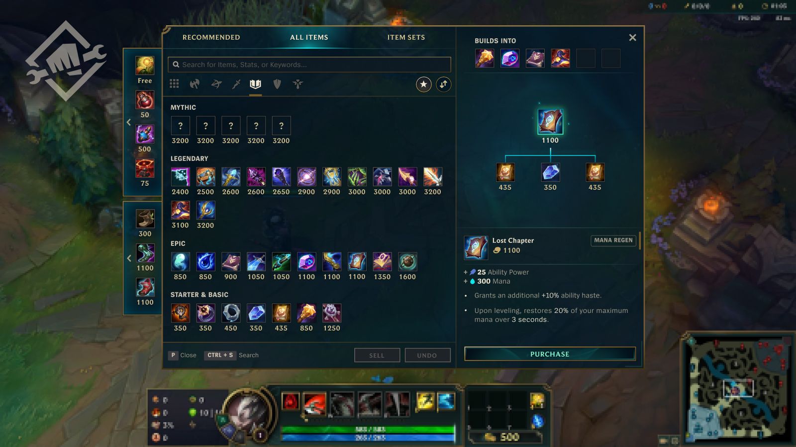
The All Items Page, is where you go to find….all the items. If you are the type of player who wants to craft your own build in real time this is where you will go.
The page has a few features worth calling out:
- A series of tabs that let you filter items by the classes that typically build them. If you’re a Tank, everything you need is probably inside the Tank tab.
- A Popular filter that lets you use the data from the recommendation system to view only the items your character most commonly builds. (When the filter is off you can still see those items indicated by a star)
- Items are separated by their rarity. Instead of sorting by price like today you can actually see all your basic & starter items in one place, as well as all your top-tier mythics and legendaries in others.
- Initially on PBE we will not have stat filters, but they are coming soon in a later PBE update and will be ready for the preseason patch.
A new Item Set Page will be coming to PBE at a later date (still in time to ship with preseason), but maintains all the functionality you know and enjoy today. Custom item sets will be supported, as will 3rd party applications loading dynamic sets for your champion.
In addition to these pages, we’re introducing Quick-Buy sidebars. These sidebars appear in both the Recommended and All Items views, and offer you easy access to commonly purchased items like potions, elixirs, wards, and boots. Now you have no excuse not to buy vision wards becausethey are always available.
Item Icon Update
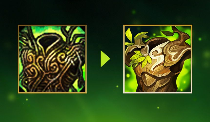
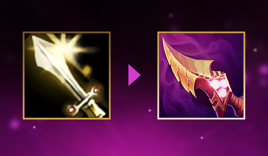
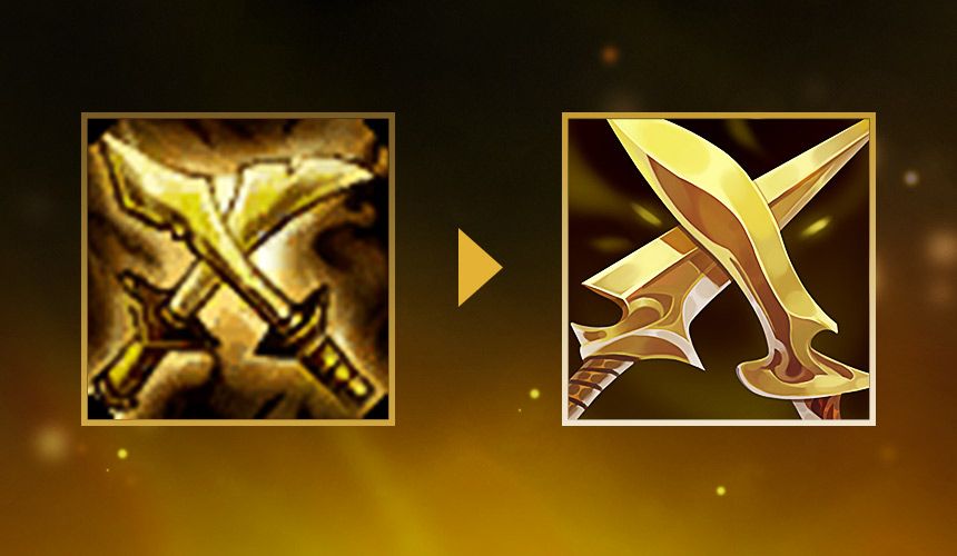
A key part of the revamped item experience is to fully update all of our icons to a modern style, whether complete redos to 10-year-old OGs or slight touch-ups to more modern additions. We’re targeting a few different goals simultaneously with these updates:
- Readability - This is our most important goal. Every item icon needs to have a distinct silhouette and color palette so that it’s instantly recognizable in the shop, inventory, scoreboard, and other places that it will appear. Don’t expect to blow up these icons to a wallpaper size and find intricate details; we need them to have clear visual reads in small sizes for gameplay clarity.
- Gameplay Match - We want the icon and theme to convey the stats and gameplay of the item. Players should be able to get a thematic sense for the gameplay effect when looking at the item art. We try a variety of techniques to make this possible like lining up the thematic for the intended class (bows for marksman items, heavy armor for tank items). We also try to match the colors of the icon with the colors of the defining stats. This works well, but we can't apply it too rigidly or we end up with all AD items as the same color.
- Art quality - Many of the existing item art is as old as LoL, dating back to 2009. Our art team has refined and developed our art craft and art style so much in that time. We want to bring each item to life in a more polished and beautiful render.
- Familiarity - Good change is good, but change for the sake of change is something we want to avoid. In most cases we hope that each new icon is immediately recognizable for players that have gotten used to the old silhouettes and colors.
- Theme and IP - We want to use the opportunity to make these powerful items fit into—and even sometimes deepen—the lore and world of Runeterra.
With these goals in mind, some of our existing items only needed small changes to meet our goals while others needed large changes or in a few rare cases, a complete retheme. Here are some before and after examples showing a range of change:
Preseason PBE is Coming
If everything goes well, we will reveal all and bring the full preseason content to PBE in less than two weeks! At that point you will be able to see and play with all of the new items, shop, and other preseason changes. As always, the PBE is a place for unfinished work, so we’re going to be listening to feedback and making any changes we need to before the preseason patch in November.
Thanks again everyone for playing. Stay safe out there.
Scruffy


