/dev: Modernizing the Monk
Hey folks! We’re the ASU team and we’re back to share all of the work we’ve done on Lee Sin’s ASU over the past year! (Editor’s Note: As a quick reminder, ASU stands for Art and Sustainability Update.)
In this dev blog we’ll be taking a deep dive into some of the different disciplines that come together to create Lee Sin’s ASU. Whether you’re an aspiring video game artist or Lee Sin appreciator, this one's for you!
Concept
Megan “Ze Ocelot” O’Rourke, Concept Artist:
Creating Consistency Across Skins
Lee Sin has been around since 2011 making him a teenager as of this year! He’s a veteran at this point and, since his release, he’s collected quite a few different looks and fantasies. But over time this resulted in some unintended consequences like inconsistent body proportions and likeness. These ultimately affect a champion’s rig and 3D model, changing how they feel when they’re moving in game.
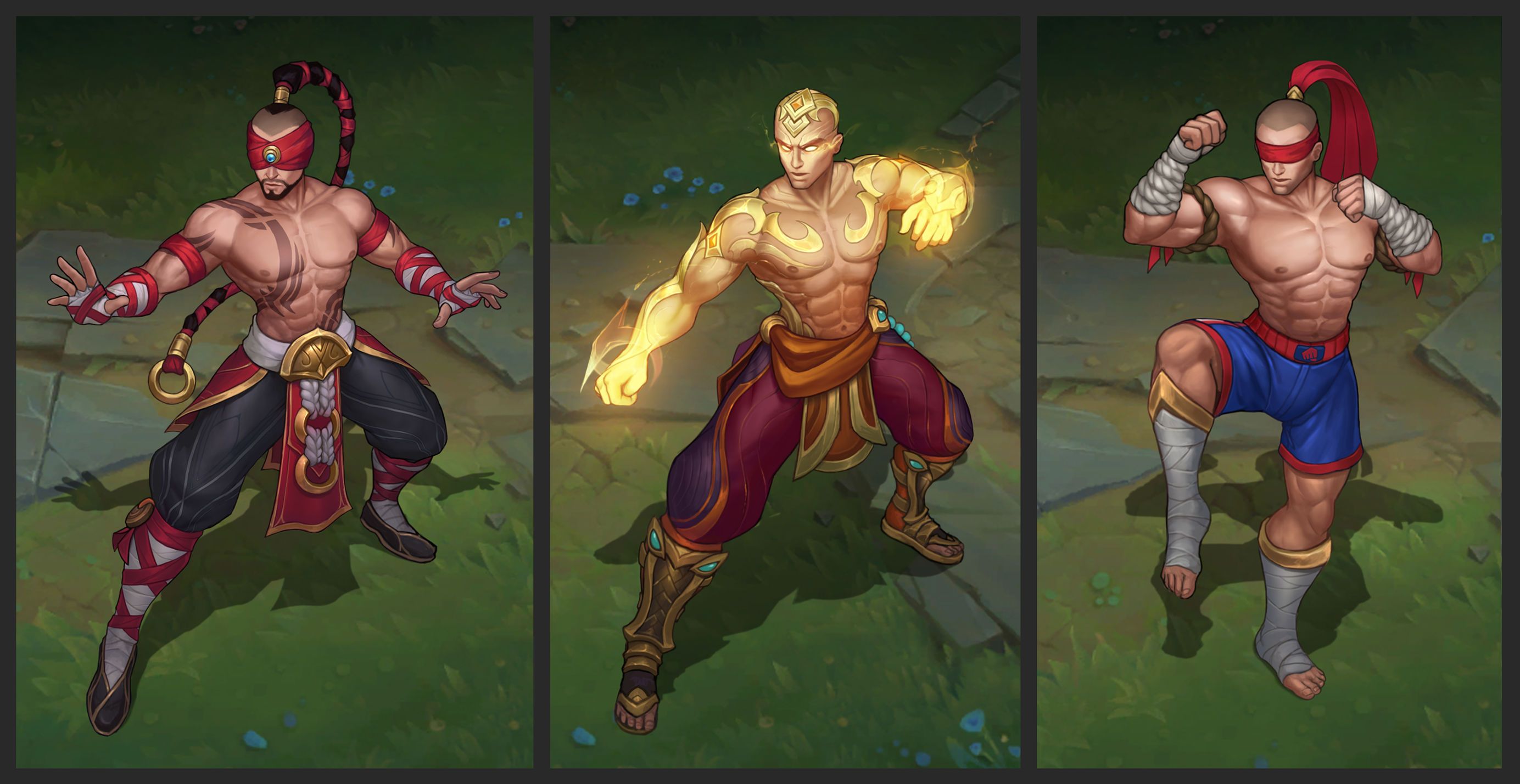
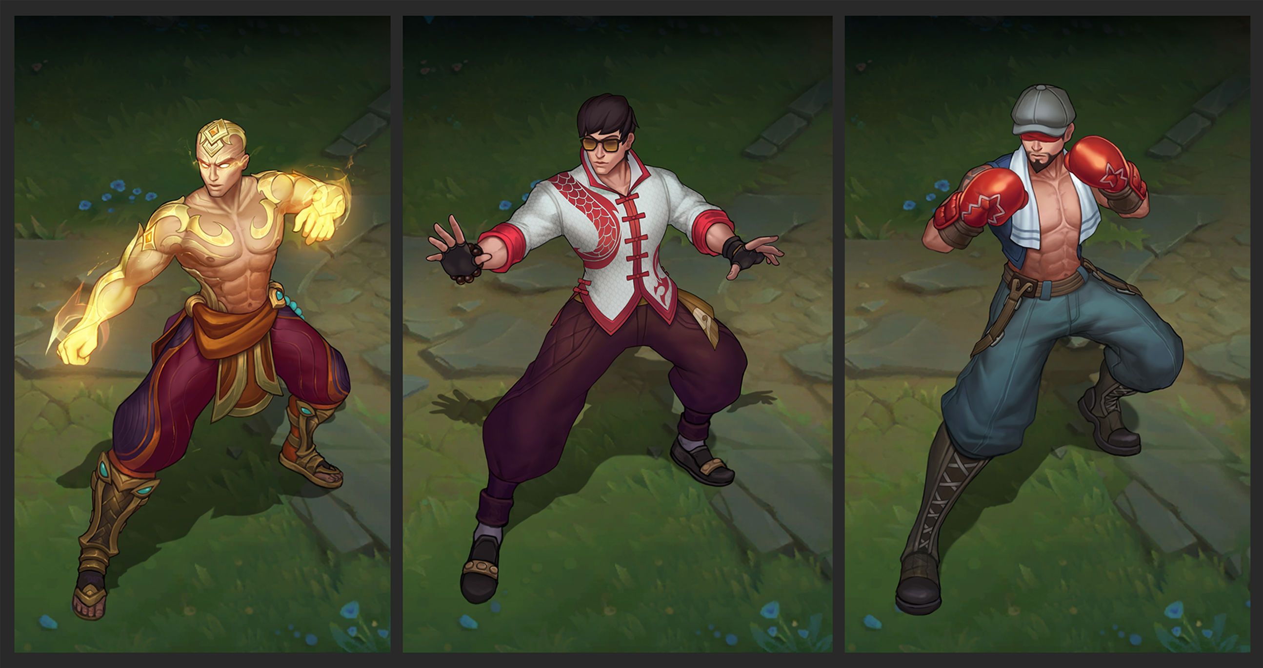
In order to help 3D modeling and rigging (which helps set up how the model moves) create consistent proportions, we updated the concept art for each of Lee’s skins to match his new ASU look. Since Lee Sin’s updated build is similar to martial artists (toned and muscular while also lean and fit), some of Lee’s older skins just didn’t match anymore. When body proportions feel wildly different from one skin to another, you lose a bit of that character’s identity when you’re playing them. For instance, God Fist is considerably more buff and bulky, so we had to tone his build down. Meanwhile, Muay Thai’s musculature is different, so we adjusted the anatomy to match the base skin a bit more.
Left to Right: Base, God Fist, and Muay Thai Lee Sin post-ASU
The same can be said for likeness, which is like a portrait! Concept artists create the template so that the rest of the team can do their work without having to make adjustments later. At this point we establish things like skin tone, facial features, facial build, and so forth. Having these features be consistent helps future concept art stay consistent, which then makes 3D and illustration consistent too. Sometimes, certain skins also include adjustments to a character’s color or hue. This can be seen in Lee Sin’s Nightbringer and God Fist skins.
From Kung Fu Flicks to Boxing, Lee’s got an outfit for every occasion
When Skins Requires Touch Ups versus Overhauls
With how many skins Lee has it’s natural to wonder how many changes each skin goes through? The answer is: it depends!
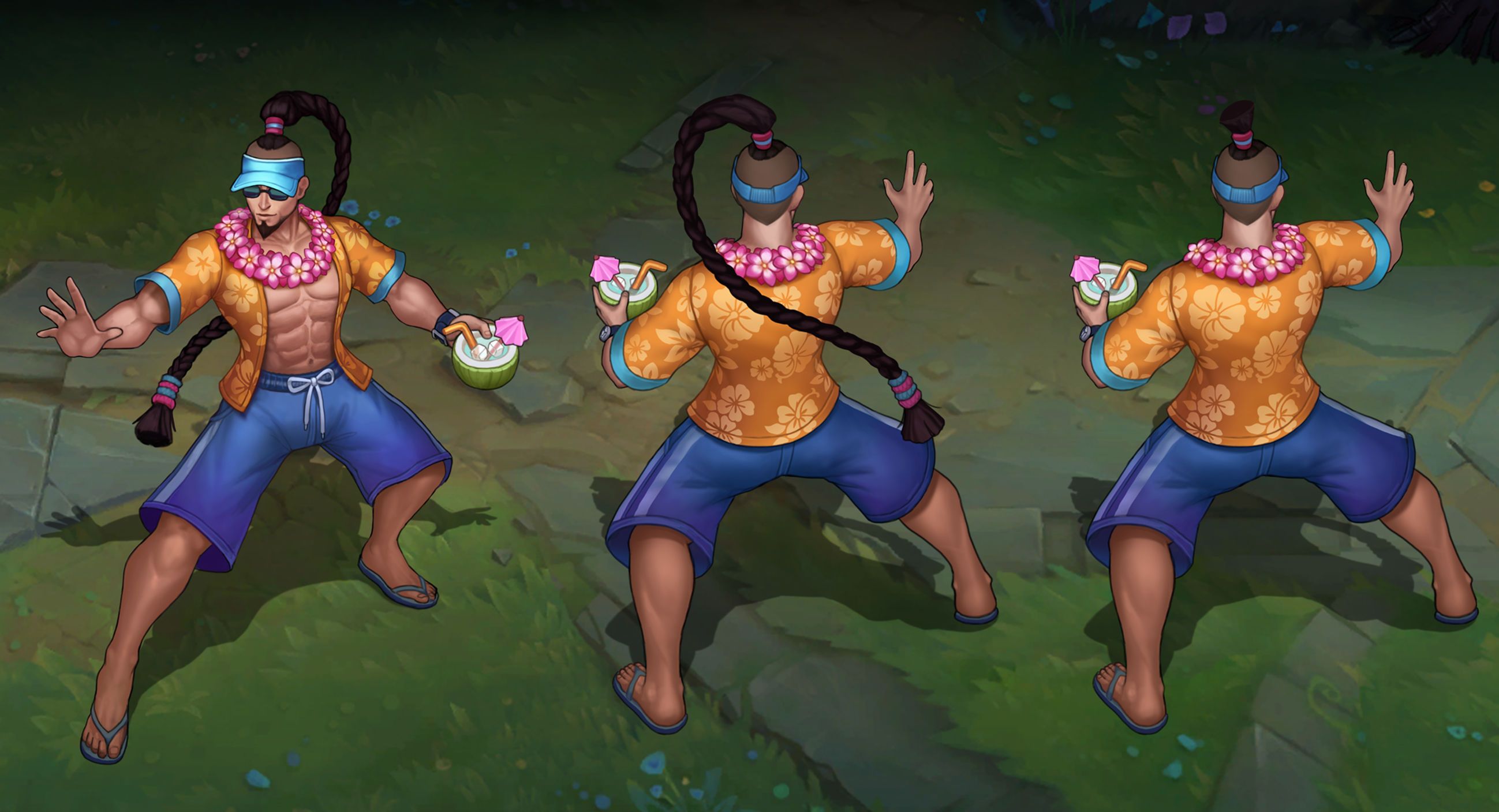
Updating skins can be incredibly exciting but also very tricky. Some skins are simple to update because their fantasy is already clear and strong. For instance, Pool Party Lee Sin didn’t need too many changes because the fantasy and execution of the skin was already clear.
Pool Party Perfection
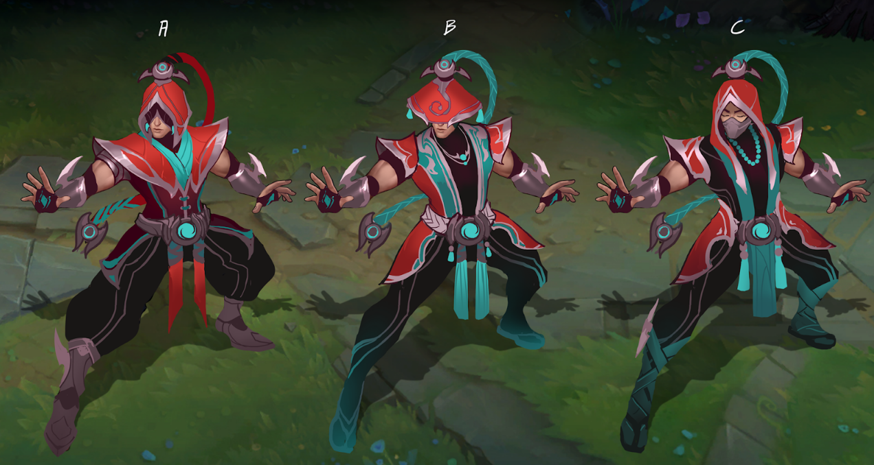
More recent skins also undergo fewer changes because their worldbuilding and visuals are more cohesive and figured out, such as Nightbringer and Zenith Games. However, some skins lack an identity, for example, Lee’s Acolyte skin was always a bit of an enigma. Could this skin exist on its own, or could we tie it to an existing universe?
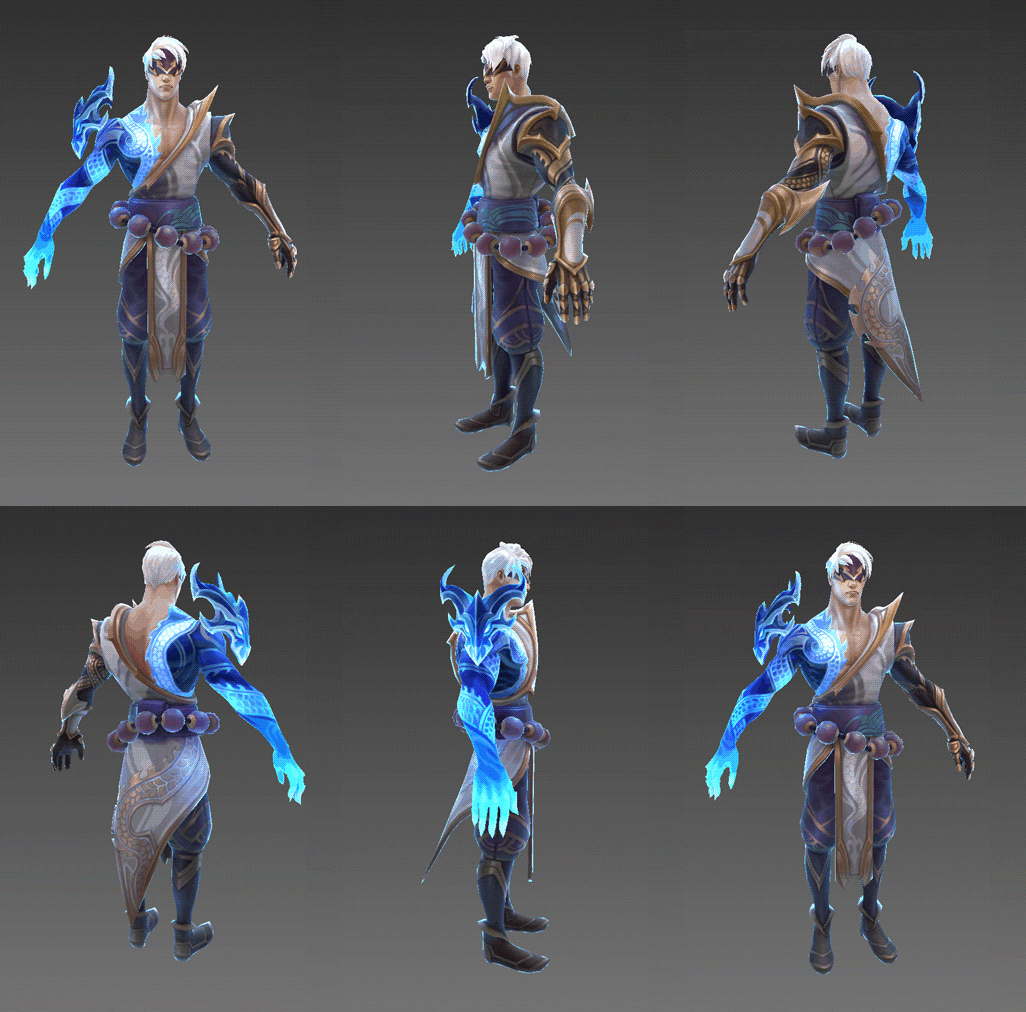
When we first started exploring concepts for the skin, we set out to see if we could make the skin exist as part of an alternate universe that reflects Lee Sin’s Ionian roots. This led to the decision to go with colors that are reminiscent of the skin’s original colors.
Early explorations of Acolyte Lee Sin
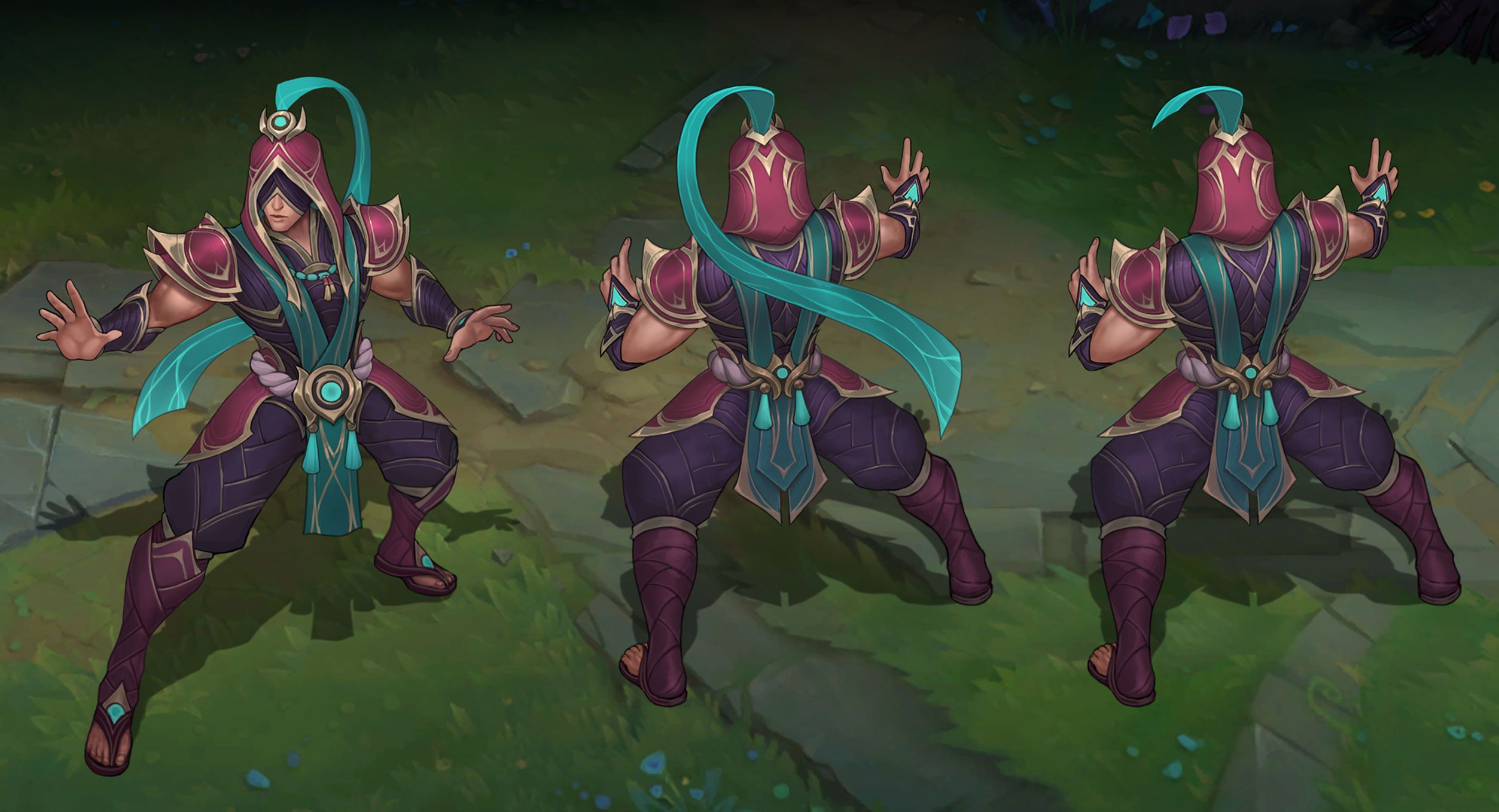
The first direction, Option A, felt the most resonant in terms of shapes and design, but maybe we could tie this skin with another champion from Ionia? Karma felt like a strong choice in terms of story and connection, which steered Acolyte Lee Sin’s fantasy and color palette into a follower and disciple of Karma.
Acolyte Lee Sin’s new look
On the other hand, Traditional Lee Sin is another old skin, but one that retained the overall vibe and palette, just needing some fine-tuning and cleaning up.
Traditional Lee Sin, after his ASU
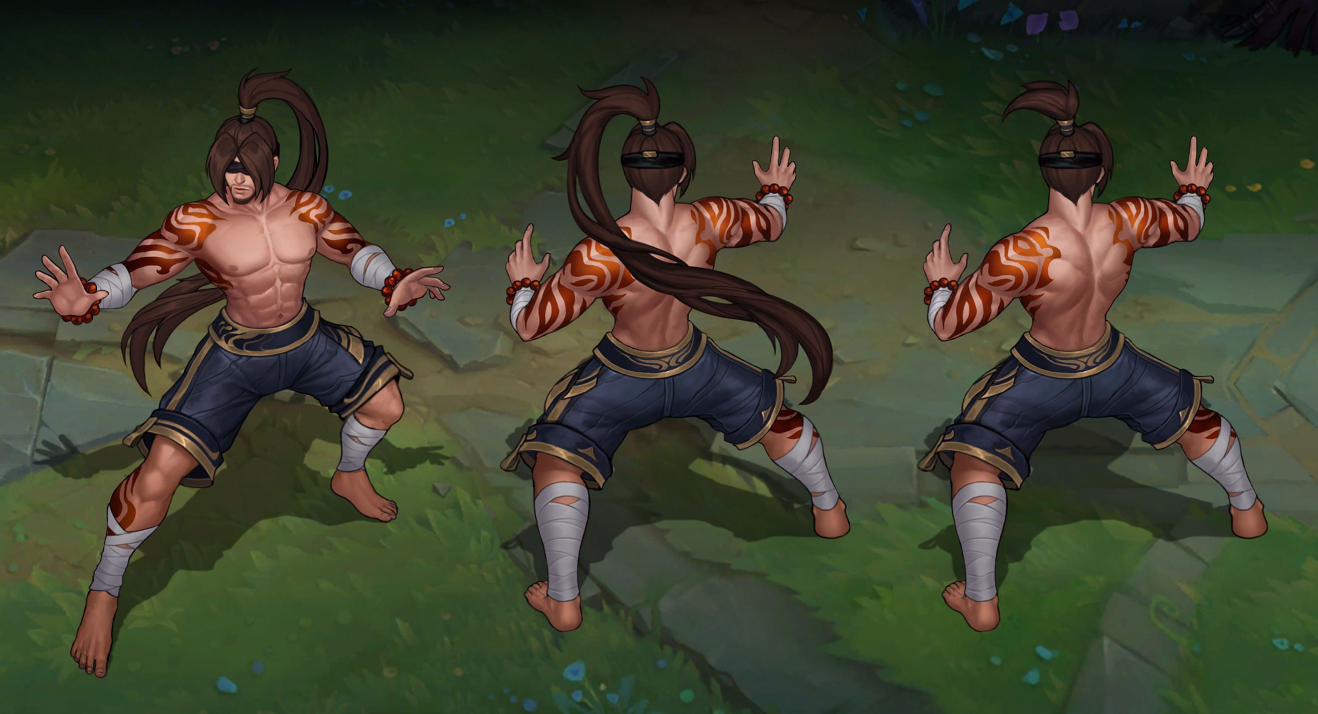
Preparing the Ponytail
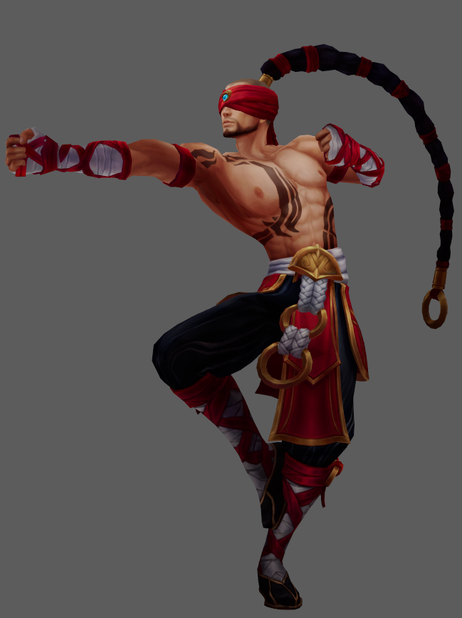
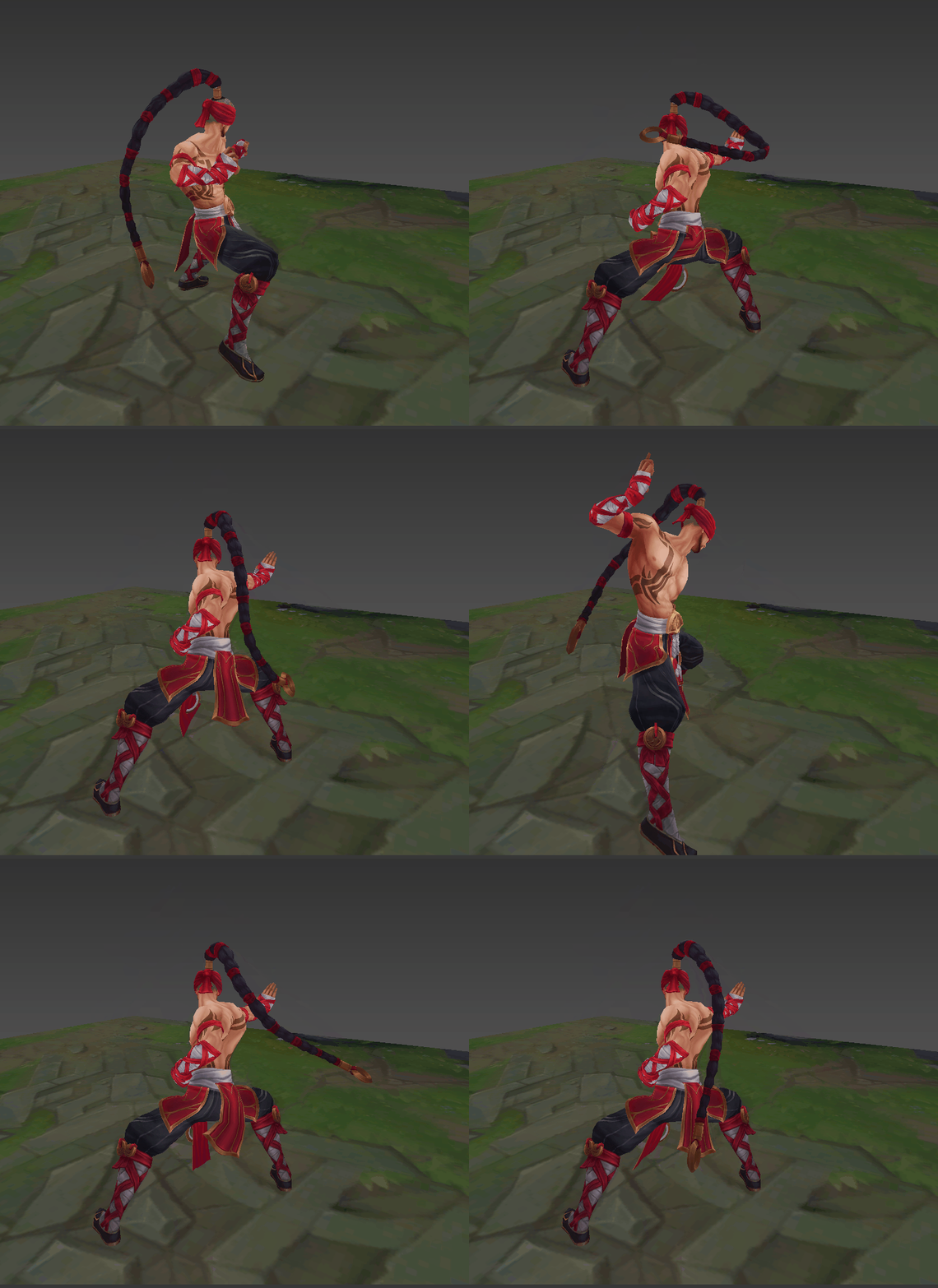
One of the questions we expect players to ask is “why give Lee a ponytail?” Well, technically Lee Sin has always had a ponytail, but it was wrapped around his shoulders and essentially glued in place. So we asked ourselves “why not make that element shine?” Adding in a more dynamic ponytail adds an interesting animation and silhouette element to Lee Sin’s design. On an additional note, there were some gameplay clarity issues that caused Lee to read as Ezreal or other human champions, so giving him a more unique silhouette should help Lee be more clearly Lee to players.
This would not only help his base and existing skins, but also future skins have a more distinct silhouette. In most cases, we were able to include the ponytail in a way that felt natural for each skin. However, there were a few times where it didn’t feel correct, so we didn’t want to force anything unnatural. That’s why you won’t see his new locks on God Fist, Dragon Fist, and Knockout Lee Sin.
Left to Right: God Fist, Dragon Fist, and Knockout Lee Sin post-ASU
God Fist is a popular Legendary skin that focuses on godly powers. We originally had a ponytail, but it detracted from the godly monk look, so we decided that a simpler look was better for this monk fantasy. For Dragon Fist, adding a ponytail drastically changed the read since the short hairstyle is so strong. As for Knockout, sticking a ponytail on his hat felt silly and weird—and we didn’t want to sacrifice that iconic cap! Losing the hat would have made the design feel incomplete. That said, for future skins, we plan for the ponytail to be an integral part of his silhouette.
3D Art
Tereza “Riot Teya” Rozumkova, Character Artist:
Making the Monk’s Model
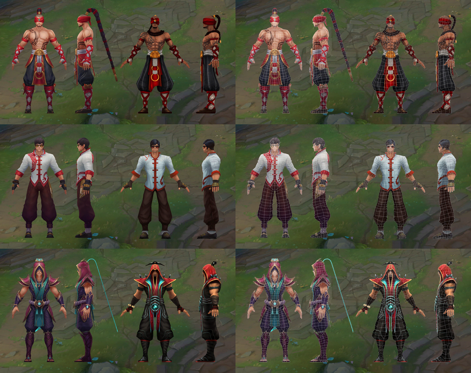
From a 3D art perspective, the main goal of ASUs has been to update our old champion models and textures to hit current League art and tech standards, while still keeping and clearly communicating parts of the champion’s identity that players have grown to love. The best way to showcase how we did that for Lee Sin is probably by comparing his old models and their new ASU versions. You can see the new ASU model on the left and the old version on the right:
Lee Sin’s updated ASU model versus the old version (mixup incoming, new on the left, old on the right)
Lee Sin’s old models were exactly that—old, and in desperate need of a full rom-com-like makeover, so we ended up starting over and not reusing many of the old geometry or textures. We re-built his model based on our current League tech and art standards while translating the new, exciting ideas that Concept Art gave us into the model. You should see a vast improvement in his posture and overall anatomy, along with improved outfits, cooler hairstyles, and new glammed-up textures that are on par with our newer champions and skins in quality.
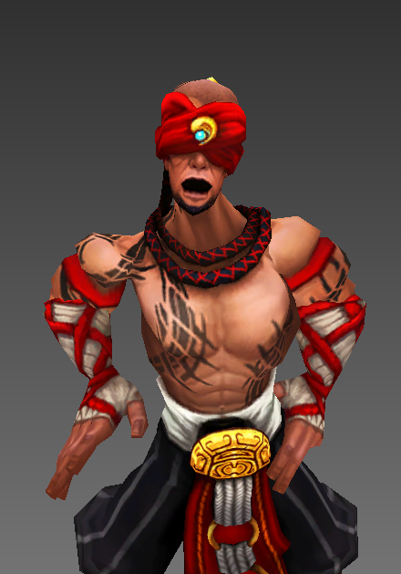
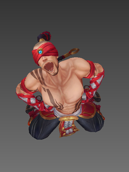
If you’re a fan of spamming your laugh after destroying your enemies as Lee Sin, you’ll be glad to learn that with the new ASU model you’ll be able to do so without looking more dead than they are! Who’s laughing now? Lee Sin, and he’s doing it in style.
A laugh only a monk’s mother could love
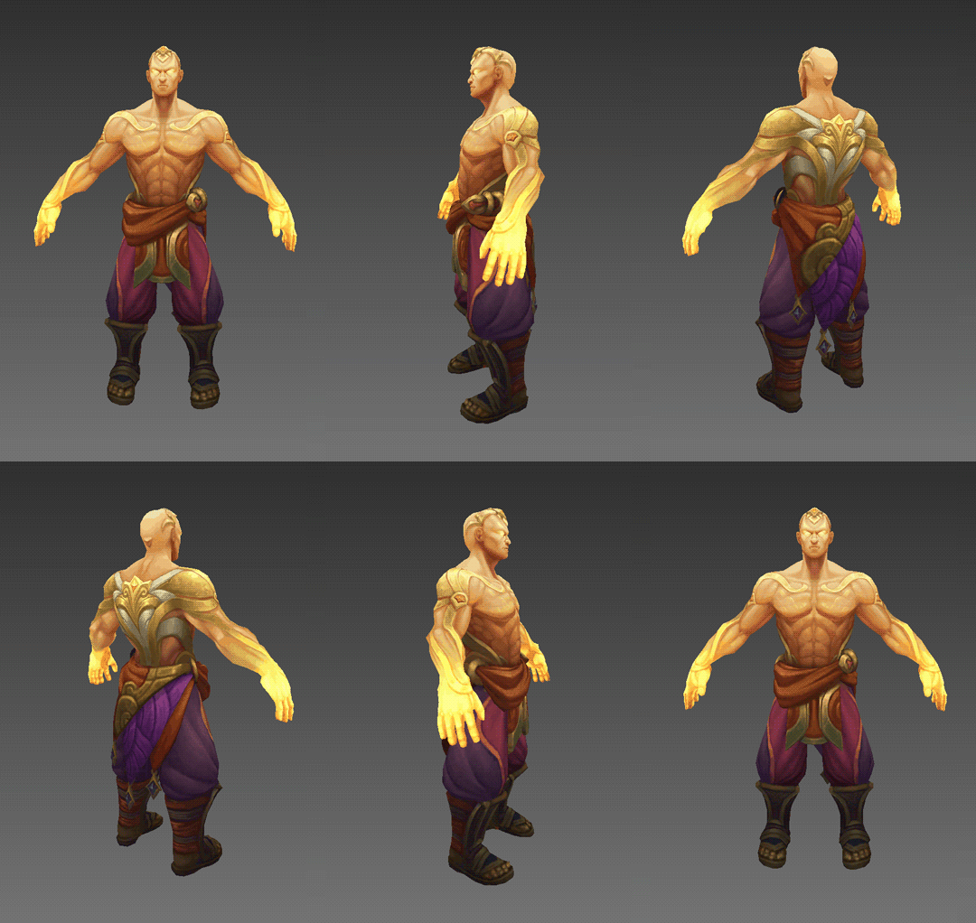
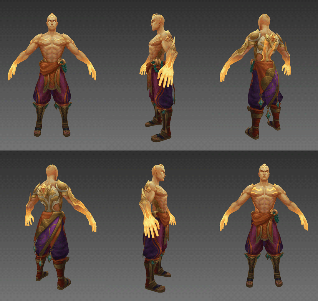
When looking back at our previous Caitlyn and Ahri ASUs, we rarely touch up Legendaries in 3D as part of ASUs, but with how outdated God Fist Lee Sin’s proportions felt compared to the rest of his catalog, we all agreed to make an exception for Lee and give him a little bit more love. We hope his updated proportions and enhanced textures help you enjoy the skin’s godly fantasy even more than before. Storm Dragon Lee Sin’s model was a lot more recent, so there wasn’t as much of a need for a big change but you’ll notice he’s now rocking his beautiful ponytail.
Lee Sin’s Legendary Updates
Base Meshes and 3D Sustainability
A big part of an ASU is the focus on the “S” which stands for Sustainability. When we develop ASUs, we aim to set anyone who works on a skin for an ASU champion in the future up for success. In the 3D Art discipline, one of the ways we do this is by creating a Base Mesh before the full ASU production starts.
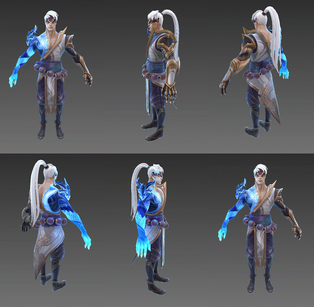
Lee Sin’s Base Mesh
A Base Mesh is a “naked” model of the champion with updated proportions, topology, face and body UV maps, and textures that will be reused as a starting point for ASU skin updates and future skin creation post-ASU. Doing the hard part of figuring out things like anatomy and facial likeness early before we start working helps us keep the champion looking cohesive throughout our work on all of their skins and beyond. It also lets us test out new features (like Lee Sin’s updated ponytail) early which can save a lot of headaches down the road. Now, thanks to his updated Base Mesh you can expect to see a way more consistent looking Lee Sin kicking his way through Summoner's Rift in both his updated and future skins.
Technical Art
Rhoam “KingRhoam” Johnson, Character Technical Artist:
What is a Technical Artist?
The term Technical Artist (TA for short) is actually quite the umbrella term. In my case, I am a Character Technical Artist: This means I deal with the insides of a character! And no, this doesn’t mean rendering Lee Sin’s kidneys. This means putting a skeleton inside of a champion’s model and making sure the character moves as expected. We put controls on this skeleton so that our animators can bring life to our champions. With that in mind, let me show you some of the cool stuff we got to create for you all!
Keeping an Eye Out for Opportunities
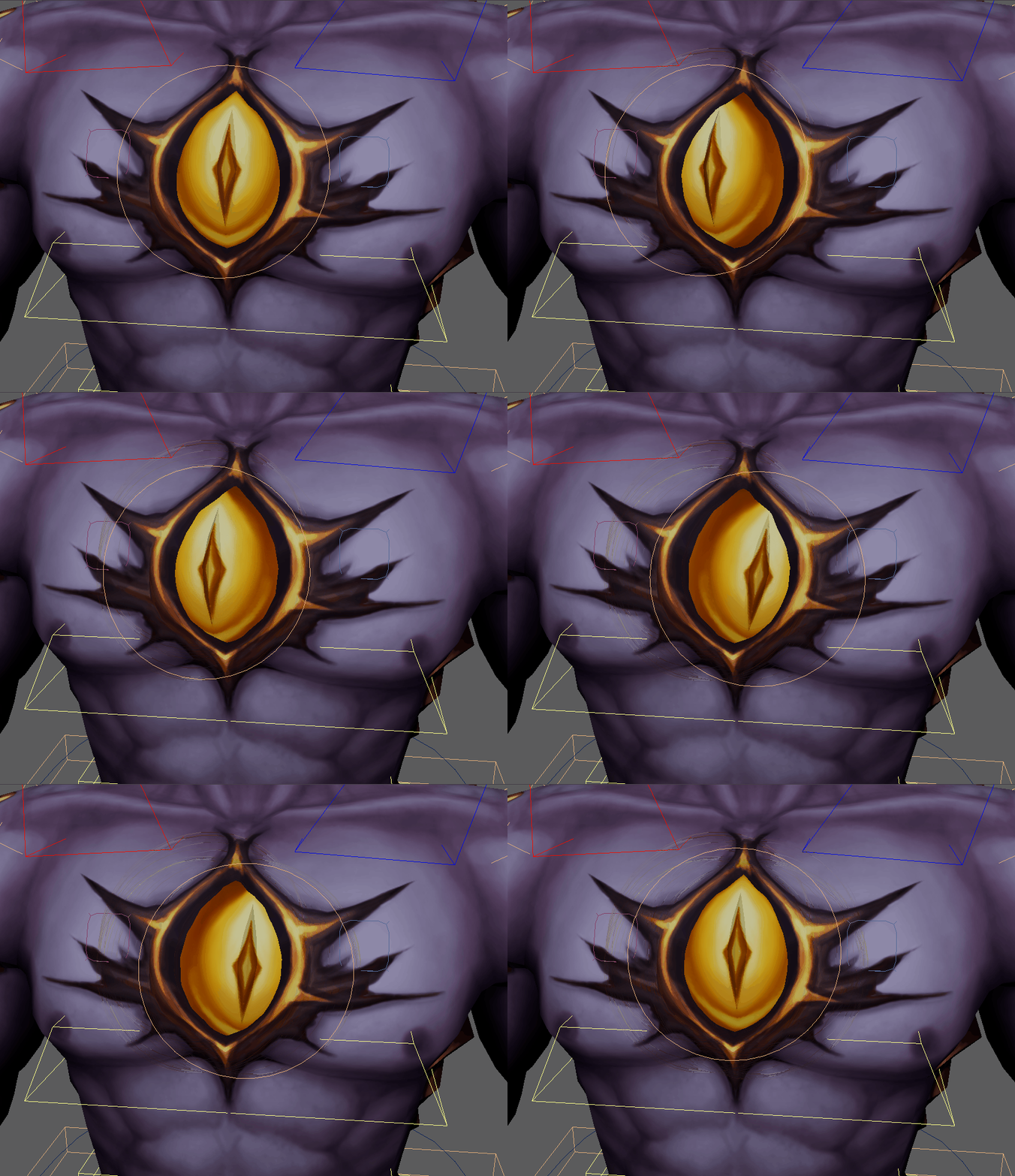
When we saw the eyeball on Prestige Nightbringer Lee Sin, we saw an opportunity to add something fun. What if the eye moved? He’s got an outstandingly large eye on his chest, it’d be a shame if it seemed dormant.
Eye have you in my sights
Mastering the Martial Arts
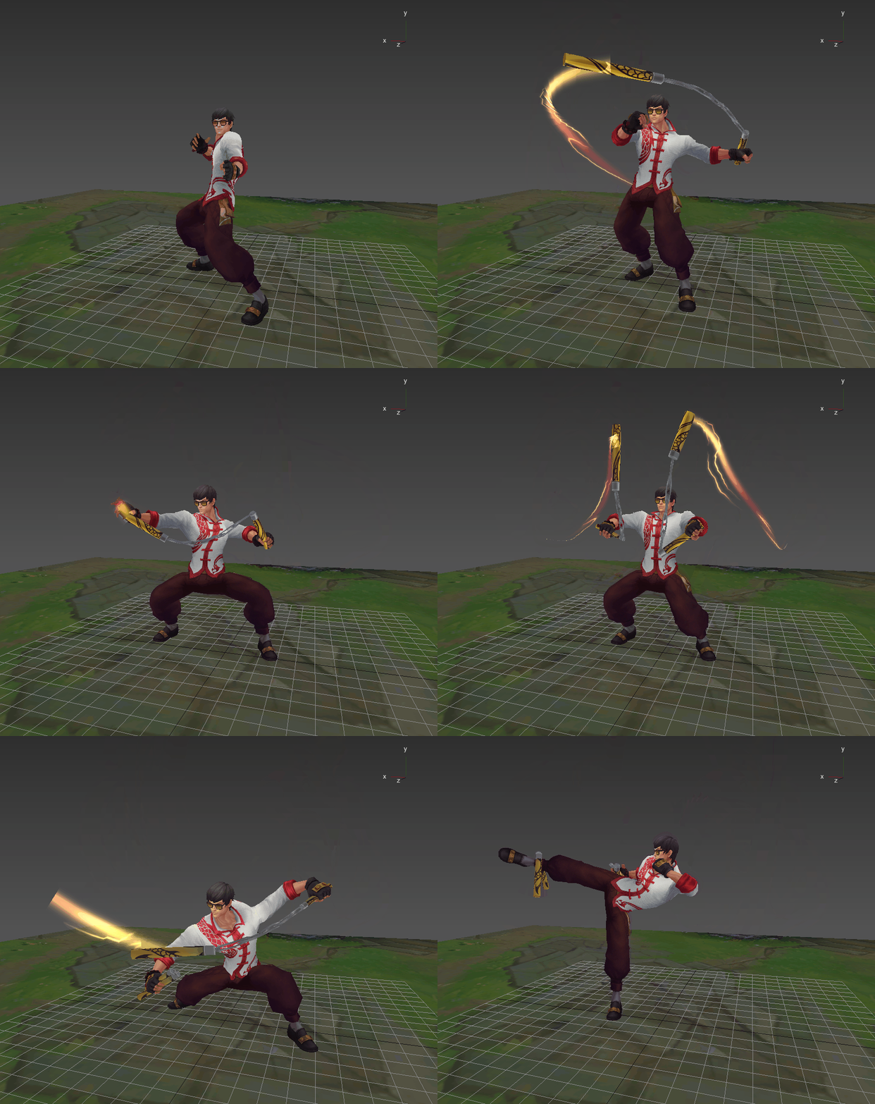
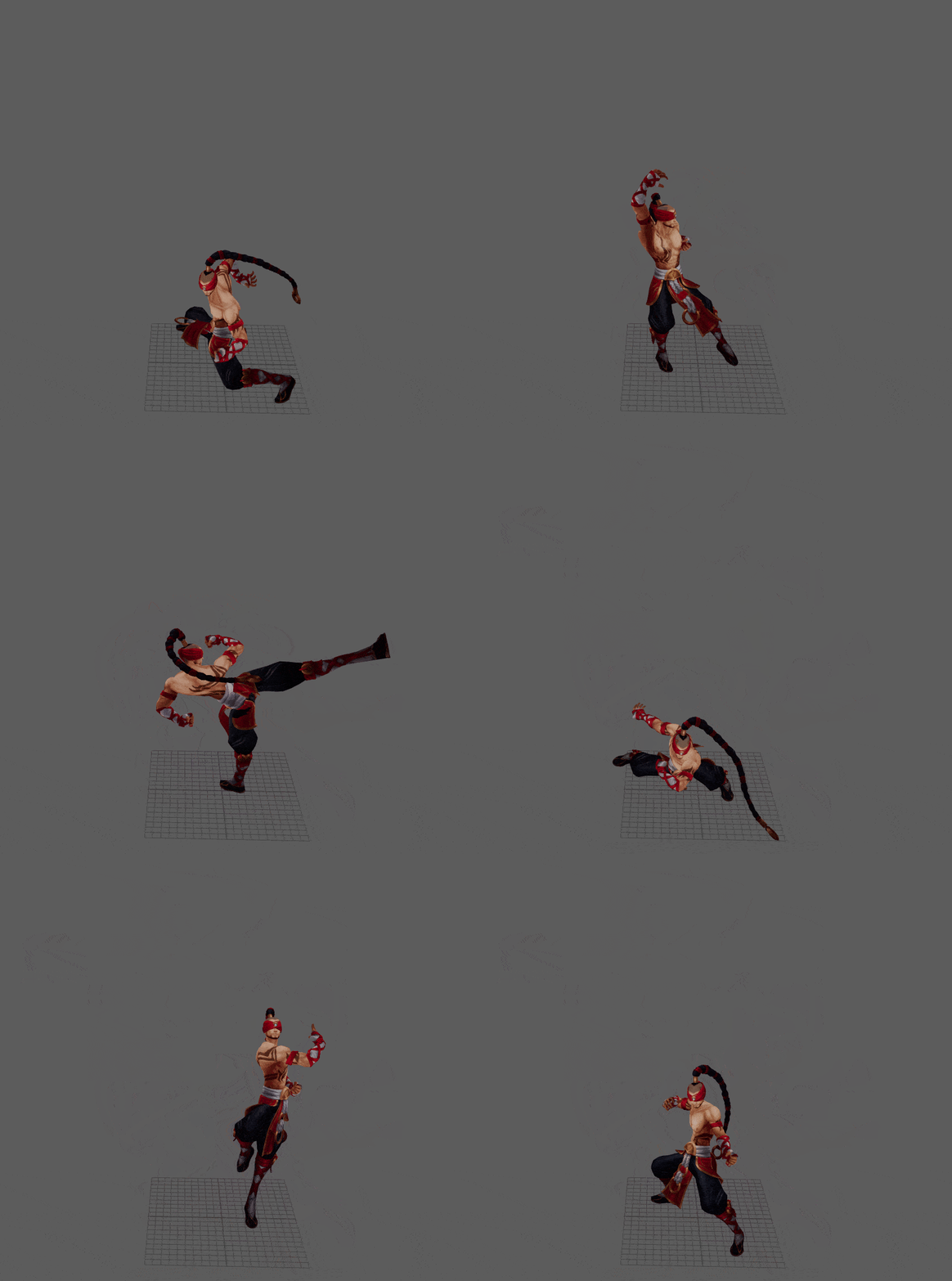
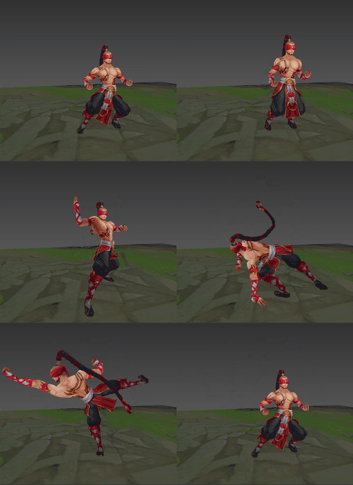
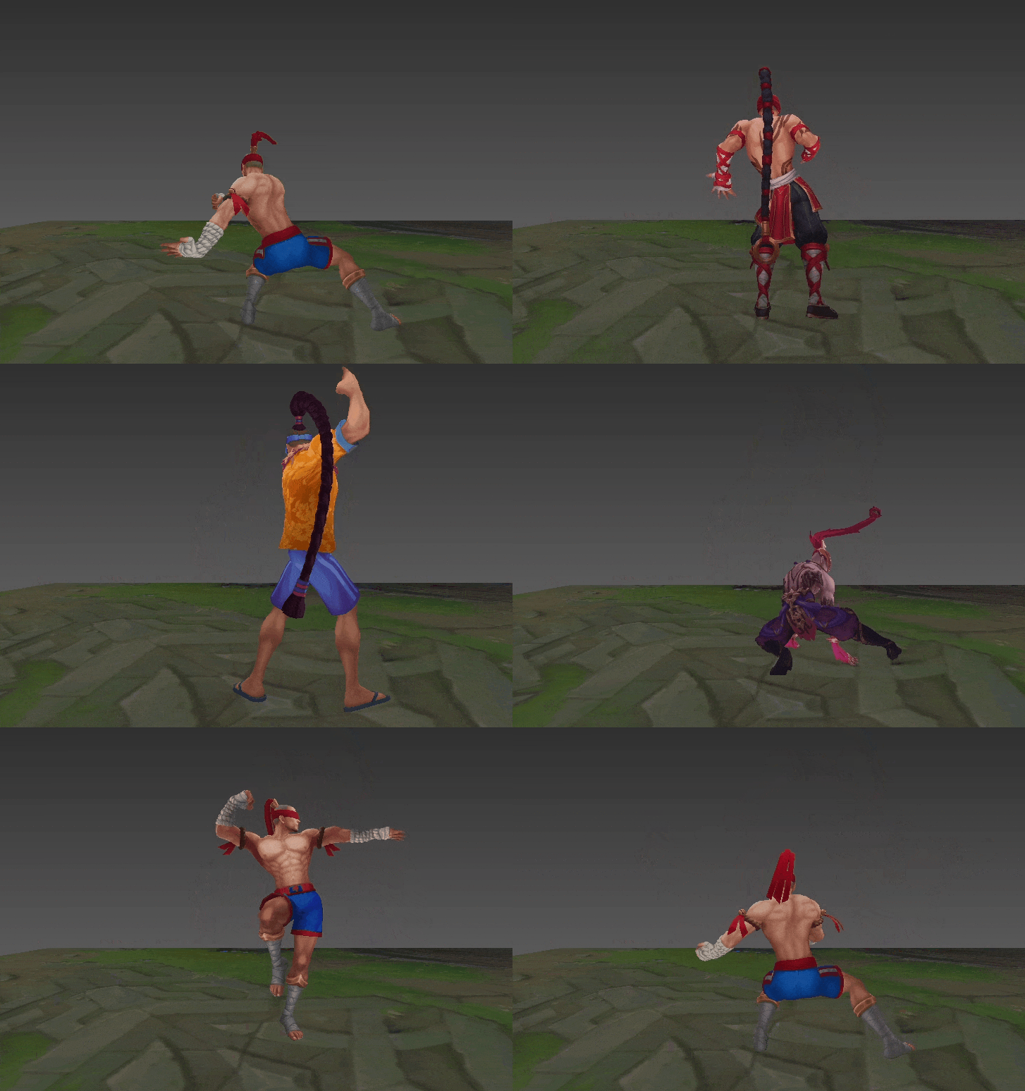
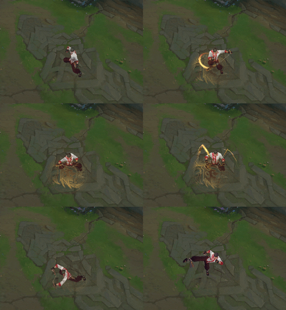
The new rig updates for Lee Sin also made it easier for our animators to nail some intense martial arts poses, which gave them the capacity to really dive into finding references to make sure they were doing the poses justice.
One Nunchaku, Two Nunchakus, Oh My!
We also made sure to give our strong lad the ability to really show off those muscles: he’s now got his very own chest and back controls. With this, we’ve set up future animators to have the ability to really push this rig to show off Lee’s strength!
Lee Sin “flexing” his new rig
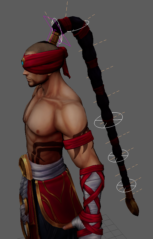
Ponytail Perfection
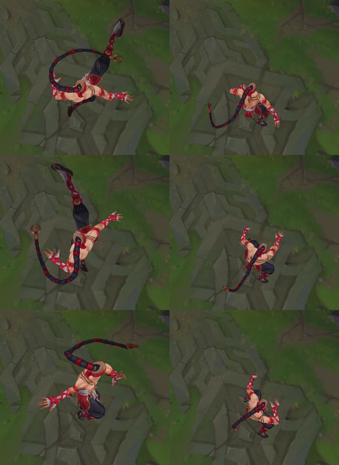
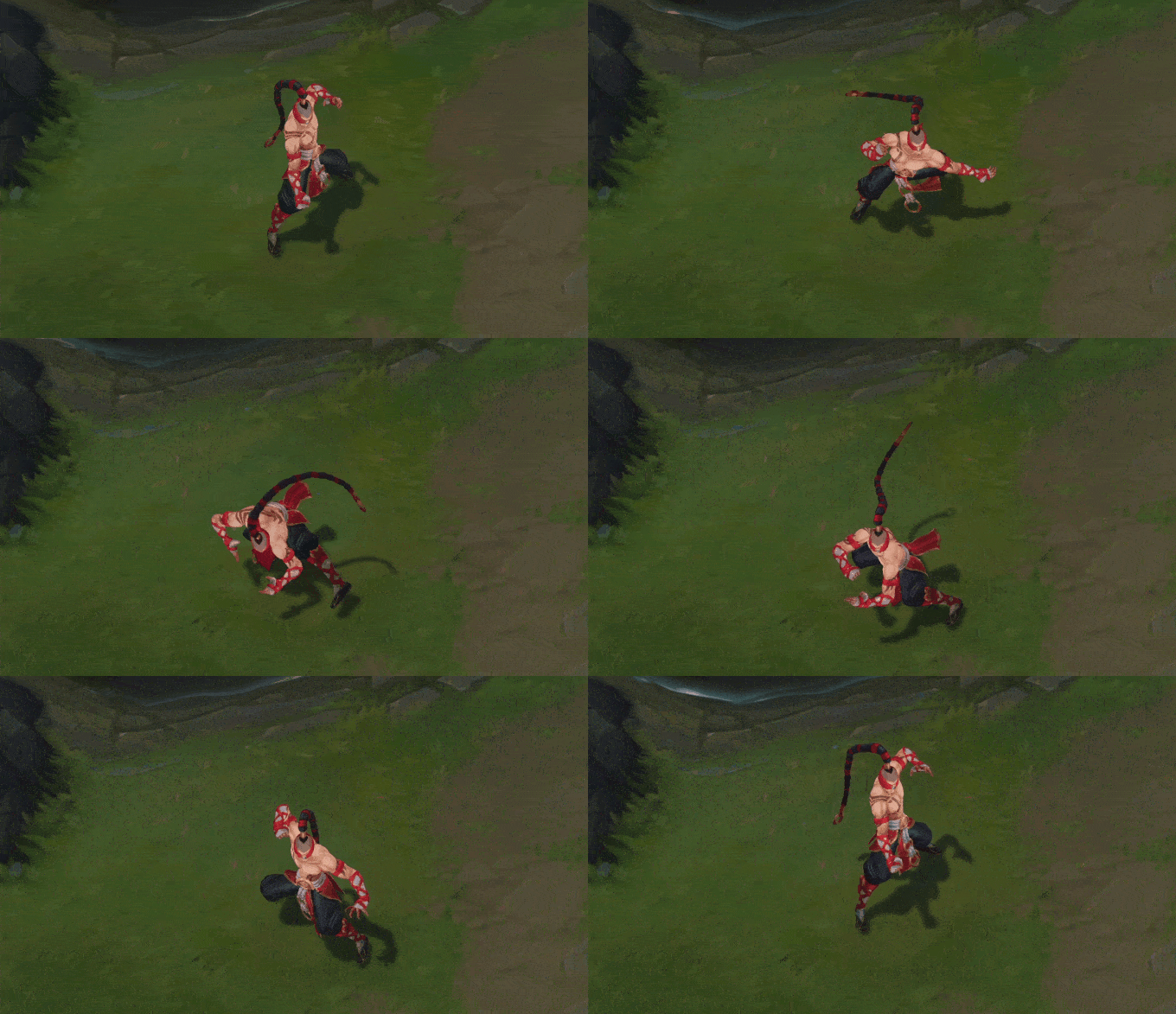
This is where our Uber rig system comes into play! Larger group controls (white) help to mold over-arching silhouettes on the ponytail, while individual controls (tan) allow for precise posing so our animators can add that finesse and personality our champions’ animations are known for. Check out some of the cool behavior we were able to achieve!
Animation
Sean “Riot Redepoka” Yeung and Einar “Riot Beinhar” Langfjord, Animation Artists:
Making Lee’s Animations More Impactful
Considering Lee Sin’s super grounded inspiration, it felt less than satisfying to see and feel how he executed his killer moves. His 13-year-old kit was full of animations that had him perform magnificent feats of martial arts… in a floaty and slide-y fashion. We saw an opportunity to really elevate his martial artist fantasy through updating his recall, abilities, attacks, etc. So off to work we went!
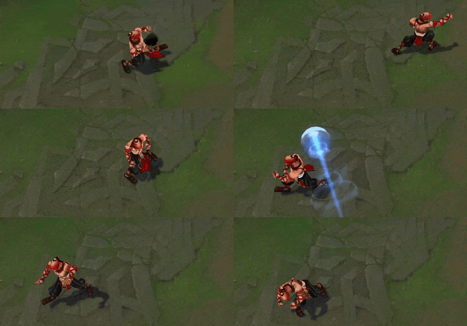
One thing you’ll notice about Lee’s ASU is that his attacks were all revamped to communicate more impact and satisfaction. Essentially, we made updates to make it feel like Lee’s punches really packed weight, but to do this we needed to introduce texture to the timing of his punches. For context, “texture” refers to the asymmetrical timing and spacing of movements and poses with the goal of highlighting them.
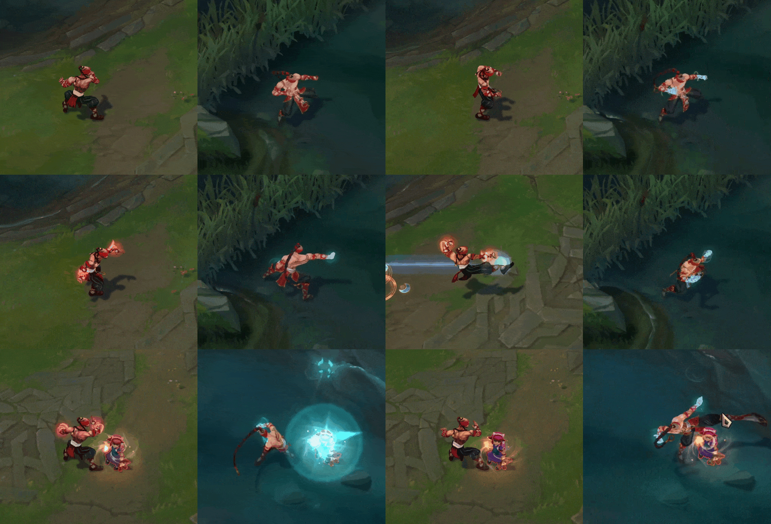
Lee’s Q and E both had pretty vague “two-pose” animations that, despite their iconicness, felt more robotic and floaty. So we updated the animations to give them some much needed weight and flair while preserving their identity. Here is a side-by-side example of what they looked like pre- and post-ASU:
Float like a Butterfly, Sliding Hitboxes like a Lee
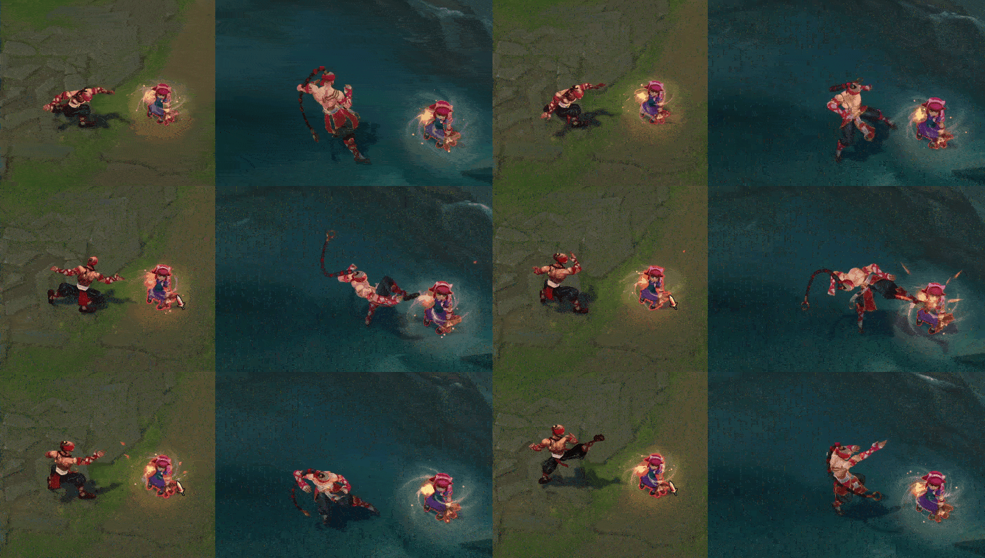
On the topic of floating, one other glaring problem of Lee’s was his tendency to float around, sometimes way outside of his hitbox during certain animations. Lee’s idle variant, dance, and taunt all had him move outside of his stationary hitbox, which could sometimes be confusing for players. Enemies would try to land skillshots and watch as Lee Sin dodged everything, matrix style. Our job here was simple: keep him inside the hitbox without removing his practiced fighting forms.
Lee Sin’s idle variant animation, now with more style per square unit
Making Skins with Style
No ASU comes without a pass over a champion’s skins! In total, Lee Sin has 17 unique skins! Introducing new silhouette elements to his visual read means that we have to ensure that said elements all animate consistently and convincingly no matter which skin is being used. His ponytail in particular must be checked constantly to ensure that it doesn’t clip into his body or the floor at any point during his animations. Not only that, he had five skins with unique animation sets (four of which needed to be re-fitted over his new models). Each new visualization of his ponytail has to be clear of potential bugs, readability or clipping wise.
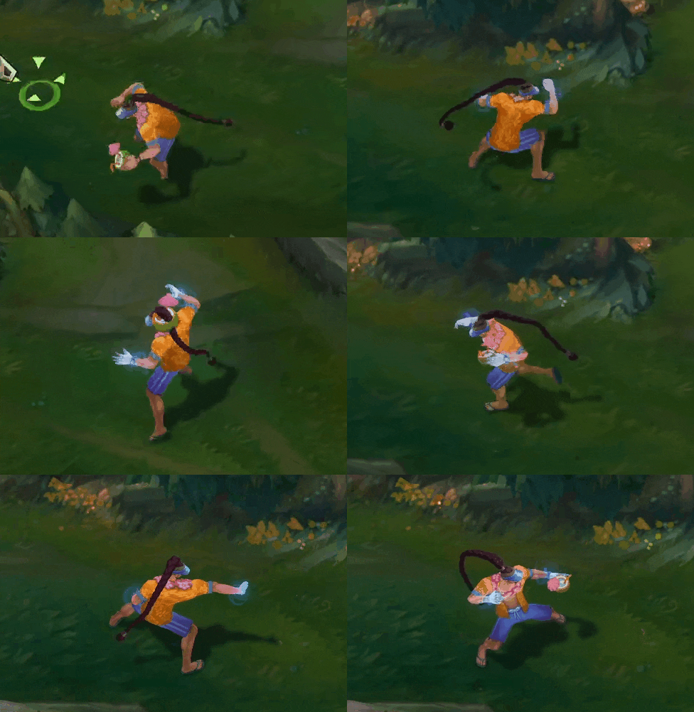
Aside from his ponytail, we thought that some of the skins would benefit from slight animation tweaks. In some cases, we even added some fun easter eggs to elevate the skins’ original fantasies!
Coconuts or Nunchucks, anyone?
VFX
Yuchen “Riot Applesoda” Lin, VFX Artist:
For the VFX on an ASU, our main goals are updating old VFX to hit League’s current visual standards and improving gameplay clarity for players. Being over a decade old, Lee Sin’s VFX were out of date compared to other recent League champions, so we had quite a bit of work to do.
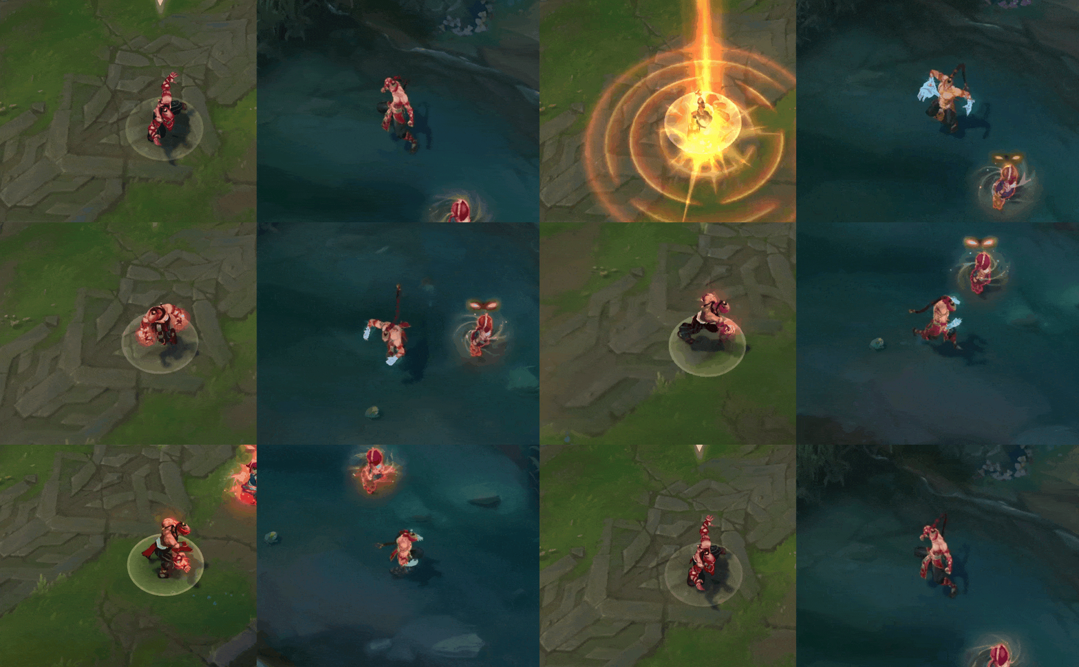
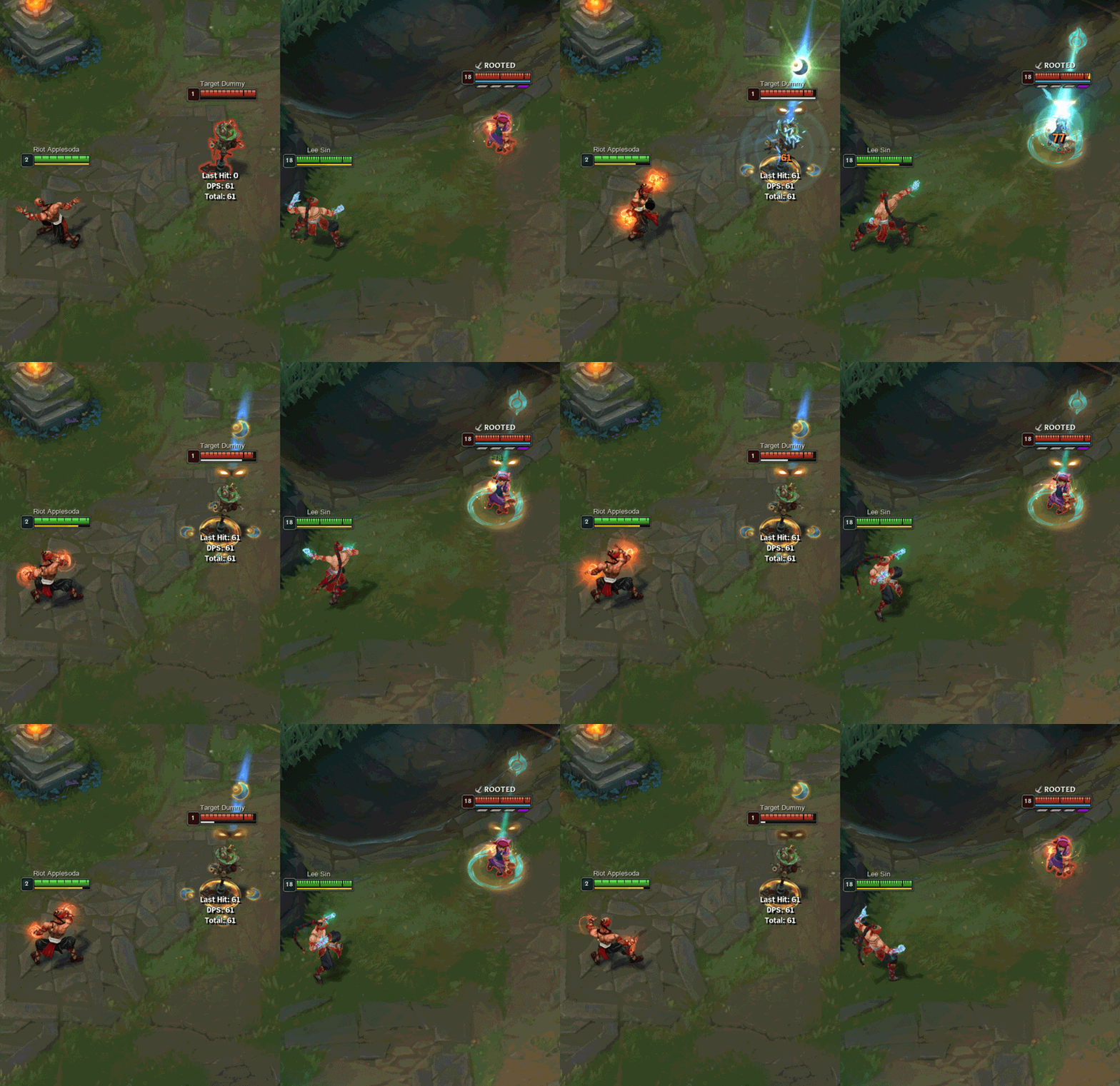
We started by giving him new decals (the shapes his VFX create on the ground) and symbol designs. Not only did his VFX get a fresh coat of paint, but we also made improvements to gameplay clarity by simplifying the decal and symbol design VFX. The old ones had complicated shapes and VFX that created confusing situations in the game for players, so there was a lot of opportunity for improvement here.
For Q, we removed the four distracting moon shapes on the ground and redesigned them to round decal shapes which are easier for players to recognize if they’ve been hit by Lee Sin’s Q. Also for the projectile, we gave Lee Sin’s Q a round head and two ribbons to establish his visual language to clearly show that it’s a Lee Sin Q and not another ability.
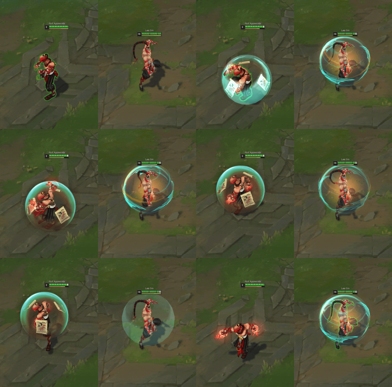
For W, the old Lee Sin shield was visually busy by having complicated objects flying around him. Plus the overall style just felt a bit outdated compared to current standards in League. We still have three flying shapes around him, but made sure they attach to the shield with some particles to give a powerful and spiritual feeling.
Turns out, paper shields aren’t so strong…
Once we were done with the VFX for Lee’s abilities we moved onto all of his skins. Many of them are quite old and not up to our current standards, so we updated most of Lee’s skins with new VFX.
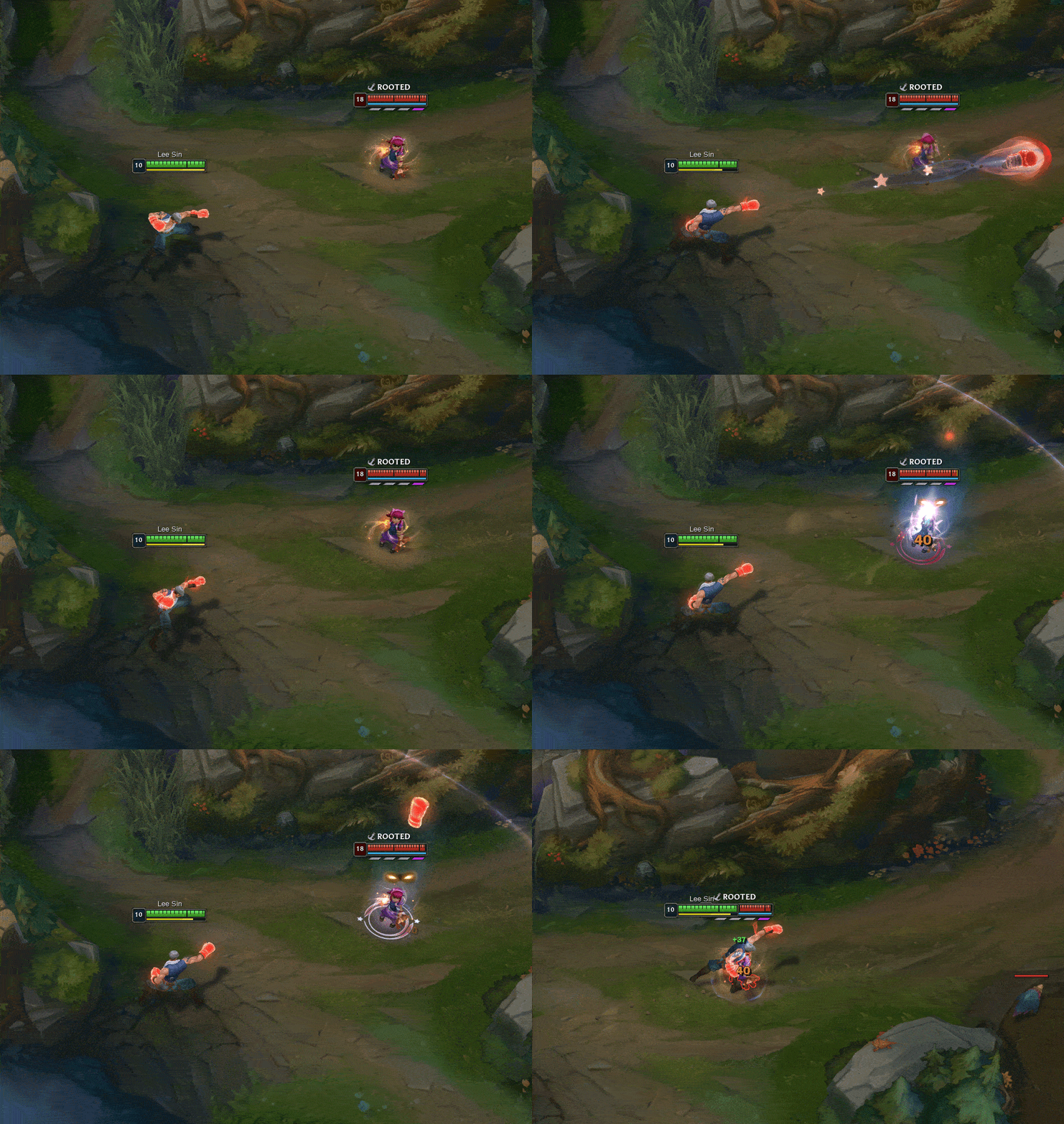
The challenge here was that Lee has a bunch of skins related to boxers, punchers, and other types of martial arts, each of which needed to represent a distinct fantasy. This meant we had to represent the different types of martial arts Lee Sin wields with VFX that also felt good to the players who’ve been maining him for years. Some skins didn’t have established thematics, like Knockout Lee Sin, which meant we needed to come up with new, unique VFX.
Knockout Lee Sin now fires a fist, much like a real boxer
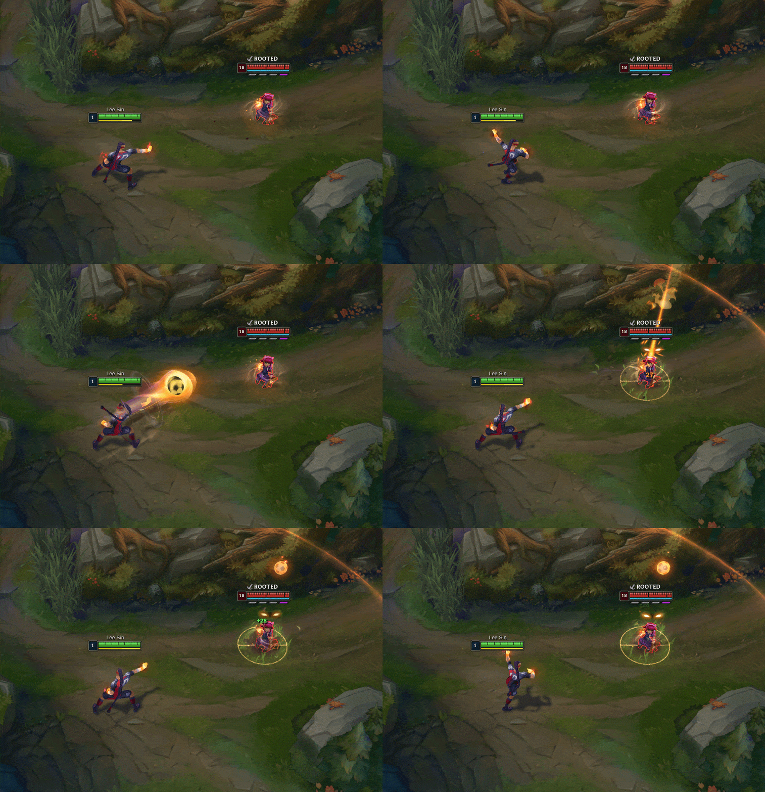
In other cases, like with Playmaker Lee Sin, we had to update older skin themes that weren’t as established. We needed to figure out how to reach the current visual standard while also staying true to the skin’s original theme.
Playmaker Lee Sin now fires a ball, much like in real soccer/football
Tackling Storm Dragon Lee Sin
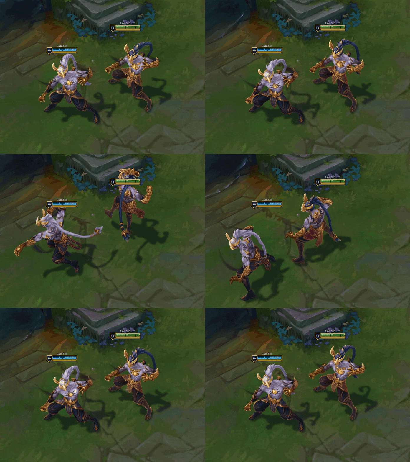
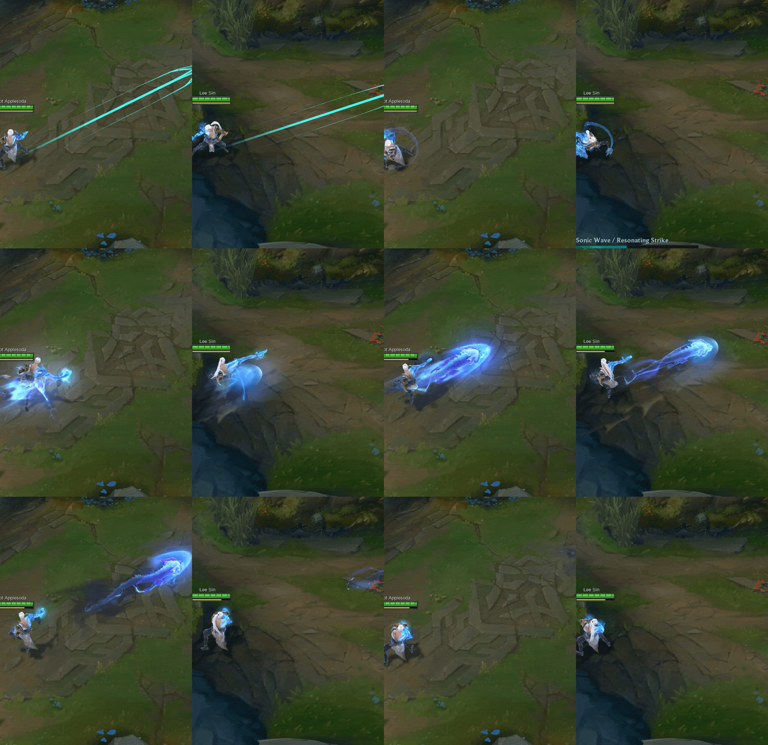
Storm Dragon Lee Sin is one of the more popular Lee skins, partly due to its unique, cool dragon VFX flying around. But at the same time we got feedback from players that the dragon VFX could be distracting and sometimes got in the way of gameplay clarity.
As part of Lee’s ASU, we set out with a mission to improve his Storm Dragon VFX. We wanted to improve his gameplay clarity while still keeping him just as cool as the original. We started by reducing the brightness of his basic attacks. Since the bright VFX could make players think an ability was coming at them, this visually signaled that the attack was stronger than it actually was, so toning it down should help reduce some confusion. For his passive we added glow on both hands instead of only his armored hand so it's easier to tell at a glance if the passive was active or not. We also updated his Q shape to follow ASU Lee Sin’s new Q design.
This should make it more clear for players playing with or against Lee Sin to tell when his Q has been used. We also reduced the smoke across all of his abilities to reduce the overall noise level of the skin.
Now you’ll still have all the cool VFX and flying dragons Storm Dragon Lee Sin is known for, but with much more visual clarity and much less confusion than before.
Audio
Andrew “Dream Theater” Grabowska, Sound Designer:
Sonifying the Blind Monk’s Martial Arts
Lee Sin’s original spell sound effects, especially the impact of them, sounded fairly similar to one another and lacked a distinctive sonic identity. The E and R impacts sounded nearly identical apart from how loud they were. Meanwhile, the Sonic Wave hit sound played on top of the Resonating Strike hit sound, which made both hits’ audio very similar while also making it difficult for different skins to highlight the significance of the Resonating Strike hit. One of our goals for the ASU was to rethink the implementation and design of these spells in a way that addressed these issues across his skins.
The spell sound effects were each redesigned to give every spell a more unique sonic identity while preserving the essence, feel, and gameplay readability that Lee Sin players know and love. We wanted the sound of Lee Sin’s magic to be reminiscent of Ionian spirit magic, but with a unique infusion of the fiery Dragon Spirit. Lee Sin’s Q and W prominently feature the more controlled Ionian and Shojin Monk spirit magic while his R invokes the untamed and aggressive Dragon Spirit.
Why Look When You Can Leesin?
Another one of our goals was to make it more obvious through sound when Lee Sin is able and unable to recast his Q, W, and E spells while making certain gameplay moments more sonically clear. For example, a new sound was added to punctuate the moment the Sonic Wave mark ends as an indication that the Resonating Strike can no longer be cast. Previously the mark sound simply faded out.
It also wasn’t possible to tell by ear whether or not Lee Sin struck an enemy with Tempest, so we added an impact sound when one or more enemies are hit as an indicator that the enemy has been marked by Tempest and the spell can be recast for the slow. Previously, Lee Sin’s Cripple spell played the same sound on Lee Sin and on the enemy when the spell was cast. This was updated so that there is now a unique cast sound that plays on Lee Sin and a separate slowing sound that plays on the enemy that persists until the slow debuff ends.
Audio Sustainability
Lee Sin’s basic attacks have an additional material layer added in depending on the material the target was made of. Towers will sound like Lee Sin is punching stone, while Red Brambleback will sound like breaking wood. This has been designed in a modular way allowing for skins to easily utilize the same tech and sounds. Similarly, the Tempest ground impact now has a ground material layer that changes based on what type of ground Lee Sin is standing on. Now when you cast Tempest in the river you’ll hear a big splash!
Lee Sin previously played the same shield sounds on both himself and allies when he dashed to them and they occasionally stacked in ways that didn’t sound as intended. We’ve now designed distinct sounds for self and ally shields that combine harmoniously.
Engineering
Matthew “spooty” Becker, Software Engineer:
Envisioning the Blind Monk’s Scripts - “Blindness is no impairment against smelly code”
Lee is one Blind Monk you can’t keep down! He’s been around for a while and, as a result, his scripts have naturally begun to show their age. The primary goal when it comes to updating scripts in any champion’s ASU (and particularly in the case of champions with a high degree of mechanical expression like Lee Sin) is to leave the base functionality unchanged while taking advantage of all the new tooling that has been created since their inception. There are a couple benefits to modernizing Lee Sin’s scripts. First, it lets us separate out skin-specific logic from his core behavior. Second, it lets us simplify the base logic in his scripts and give our artists & designers more creative power. Let’s take a look at what these points mean for the dev team and, as a player, what they mean for you!
Step One: Back to Basics - “Never again will skin-specific logic lead me astray”
Ideally, a champion’s base scripts shouldn’t contain any logic that is specific to a subset of their skins. Housing skin-specific logic in base scripts means we’re performing extra checks and operations across all skins when (by their nature) most of these steps are only relevant to a handful of skins. Worse yet, any future skins that want to incorporate cool features that deviate from the base implementation will need their own checks and custom behaviors added. Due to the sheer number of skins Lee Sin has in his catalog, there were a decent number of skin-specific operations that were in his base scripts.
Thankfully there are a lot of improvements afforded to us now that simply weren’t available earlier in Lee Sin’s lifetime. As a result, we’ve been able to either relocate a lot of skin-specific logic to scripts that are tied to those specific skins or remove the script-side solutions in favor of a more data-driven approach. With this, we’ve removed a lot of redundant checks & freed up our artists and designers to implement the new iterations of old Lee Sin skins in a significantly less-rigid environment. Additionally, this means any future Lee Sin skins will have a clearer path to achieve the vision for that particular skin.
Step Two: Clean Up Time - “I do not teach, I data-drive”
Removing skin-specific logic from the base scripts was just one part of a much larger effort to clean up & data-drive Lee Sin’s scripts. While we left much of Lee Sin’s high-level script architecture untouched (to preserve his aforementioned mechanical expression), we were able to evaluate and (where appropriate) update each of his scripts’ lower-level implementation details. This even led us to identifying a few bugs in the pre-ASU Lee Sin that were cleaned up in the process! These bug fixes are only meant to clean up visual discrepancies, not impact Lee’s gameplay behavior.
But what does it mean to data-drive Lee’s scripts (and why do I keep mentioning it like it’s something you should care about)? Well, in short, it means we’re able to put way more control in the hands of our amazing artists & designers which, in turn, gives them more avenues to make really awesome skins (and, by extension, for you to play with those really awesome skins)! By utilizing the improved authoring capabilities our tools and engine teams have created for us over the years, we’ve removed a lot of the hard-coded content from our scripts, putting more of the creative details in the hands of our creatives without impacting any of Lee’s core gameplay mechanics. In the end, the goal is more creative freedom and fewer bugs for Lee Sin… and that’s something we can all be happy about!
We’re all excited for Lee Sin to grace the Rift with his new look and we hope you are as well, so keep an eye out for his ASU coming in patch 14.9!
