/dev: The Latest on Udyr’s VGU
Hey all, Ryan “Reav3” Mireles here with another update on Udyr’s VGU, which will come out later this year. Since our last check-in, we’ve entered full production on Udyr, so this post will focus on how he’s looking in-game. But before we get into it, here’s a quick recap of what our goals were going into Udyr’s update:
- We want to preserve Udyr’s stance-changing identity and keep him as a primarily auto-attack/melee-focused champion. We think this is what makes Udyr unique and stand out on the roster. To help his gameplay feel more modern, we want to add a bit more interest to his stances and melee pattern to give some more depth to playing him, as well as make it more clear when Udyr is doing something cool (he doesn’t really have a hype gameplay moment right now).
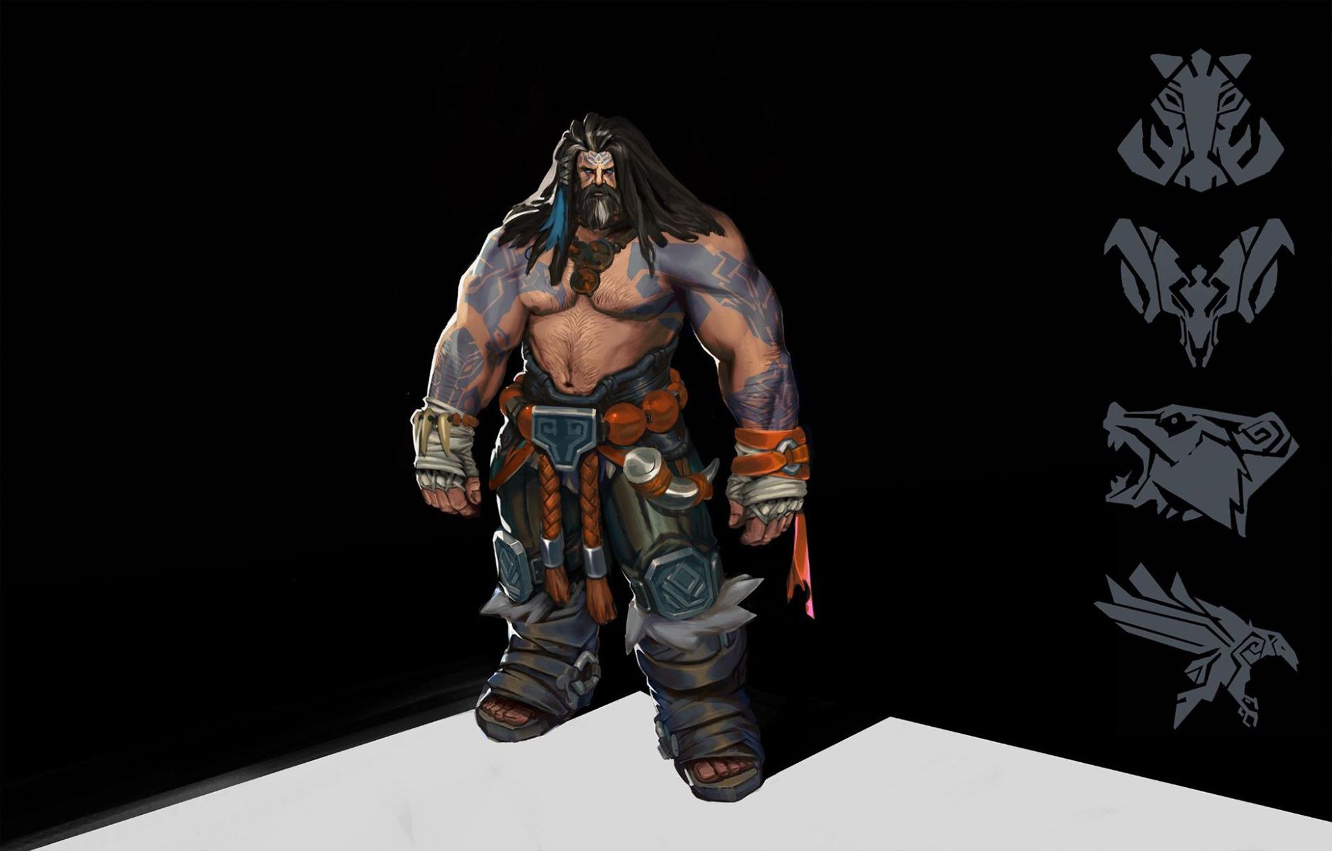
- We want to upgrade Udyr’s visuals to modern League standards while keeping his general theme of a warrior shaman intact. Our goal is to build on Udyr’s visuals, not reinvent them.
- As for his narrative, we want to bring his in-game portrayal closer to how he’s been portrayed in recent lore and give him stronger ties to the Freljord.
Oh, and in case you haven’t seen the Champions in 2022 video we released today, we decided to remove Udyr’s antlers. We know a lot of you weren’t really digging them, and once we got him in game (as you’ll see below) we felt they weren’t really needed for a unique silhouette.
And with that, on to the new stuff you all came here for!
Antlers or No Antlers?
Jason “OOYOO” Namgung, Character Artist:
Udyr’s rework has been a long time coming, and I was stoked to help recreate one of League’s most “senior” citizens.
When we got started, I assumed that Udyr would be a rather simple and straightforward champ to work on, but that façade wore away very, VERY quickly.
I got started by blocking out a proxy model to get him in-game to start testing our ideas for his visuals and gameplay. But in order to do this, we needed to get his proportions correct because without a good base we’d just be “polishing a turd.” Our goal was to make him feel like a big, strong mountain man, and that became our north star for his body type.
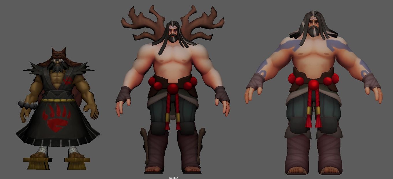
While working on his proportions, we ended up removing his antlers. While we really liked the idea of them and we tried a lot to get them to work, we couldn’t get them to not look goofy because of how hunched over he is.
In one attempt they looked like wings, and in another they looked like propellers. No matter how hard we tried to get them to work, they just always looked off. Although the idea was cool, Udyr’s the animal spirit guy, not the antler guy. So ultimately we decided to table the antlers and refocus on his animal spirit fantasy.
After we built out Udyr’s base body, we got started on his stances. And that’s when we realized the mountain man was going to be a bit complicated.
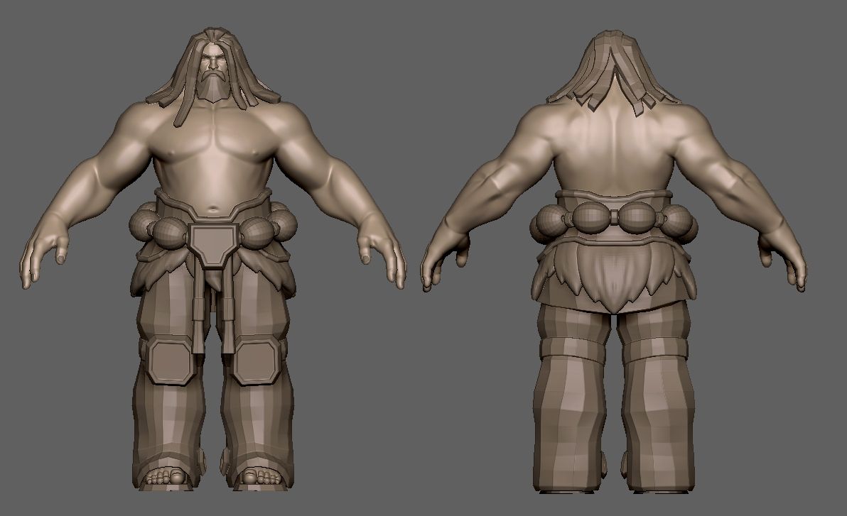
His base body was pretty straight forward, but his four stances were a major hurdle. Not only were there four of them, but we also had to make sure each one amplified the fantasy of the animal spirit they’re associated with.
We try to create sustainable resources as we go, this way we’re future proofing new champions, making it much easier to develop skins and future updates. We decided to use the same “bones” in each of Udyr’s models to keep things simple for us and help readability in game for players.
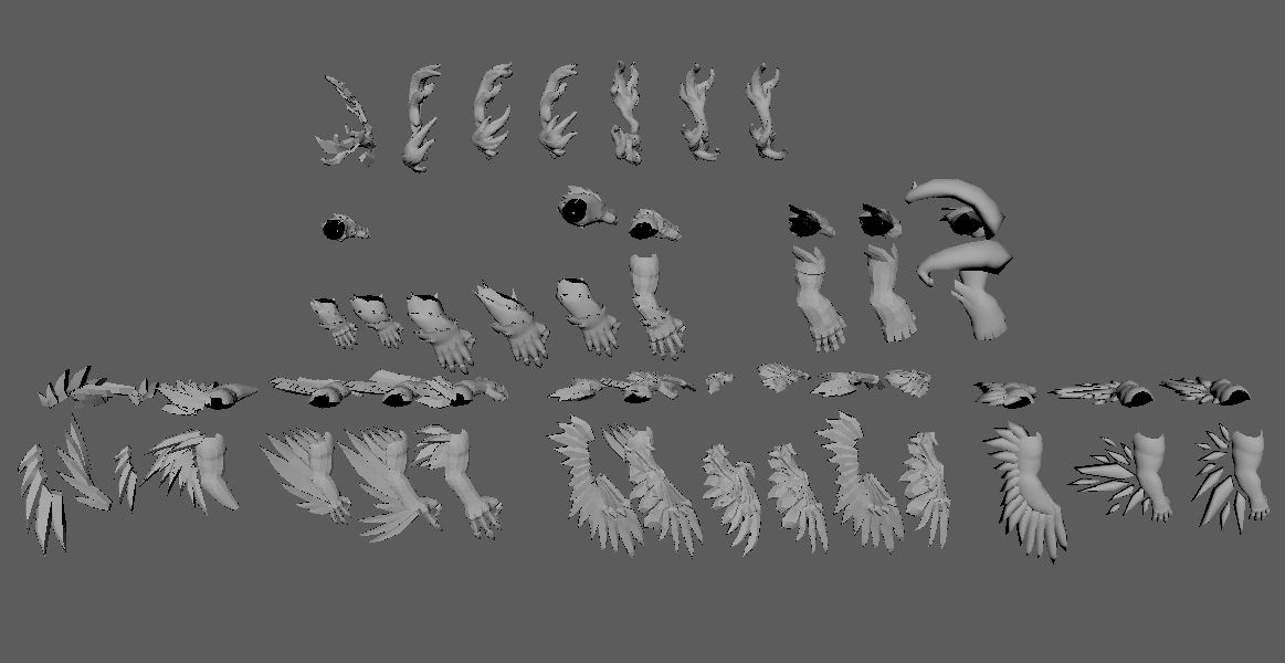
This meant we had to do A LOT of iteration to find what felt the best for our big boy. Some were simple while others required 10 or more iterations to get right.
...But that's the fun of game development!
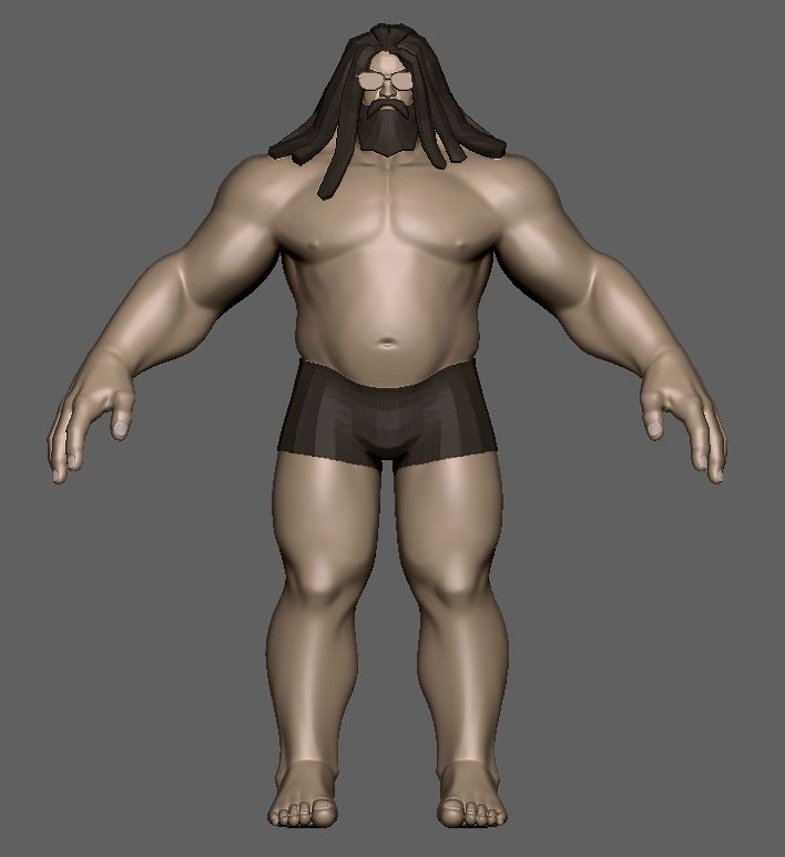
We’re still early in Udyr’s production and everything’s a work in progress, but we’re slowly getting closer to the final look and feel for our big boy. And hopefully all of you will enjoy him when he finally comes out!
Mastering Udyr’s Many Stances
Koingyeal “Koing” Jang, Animator:
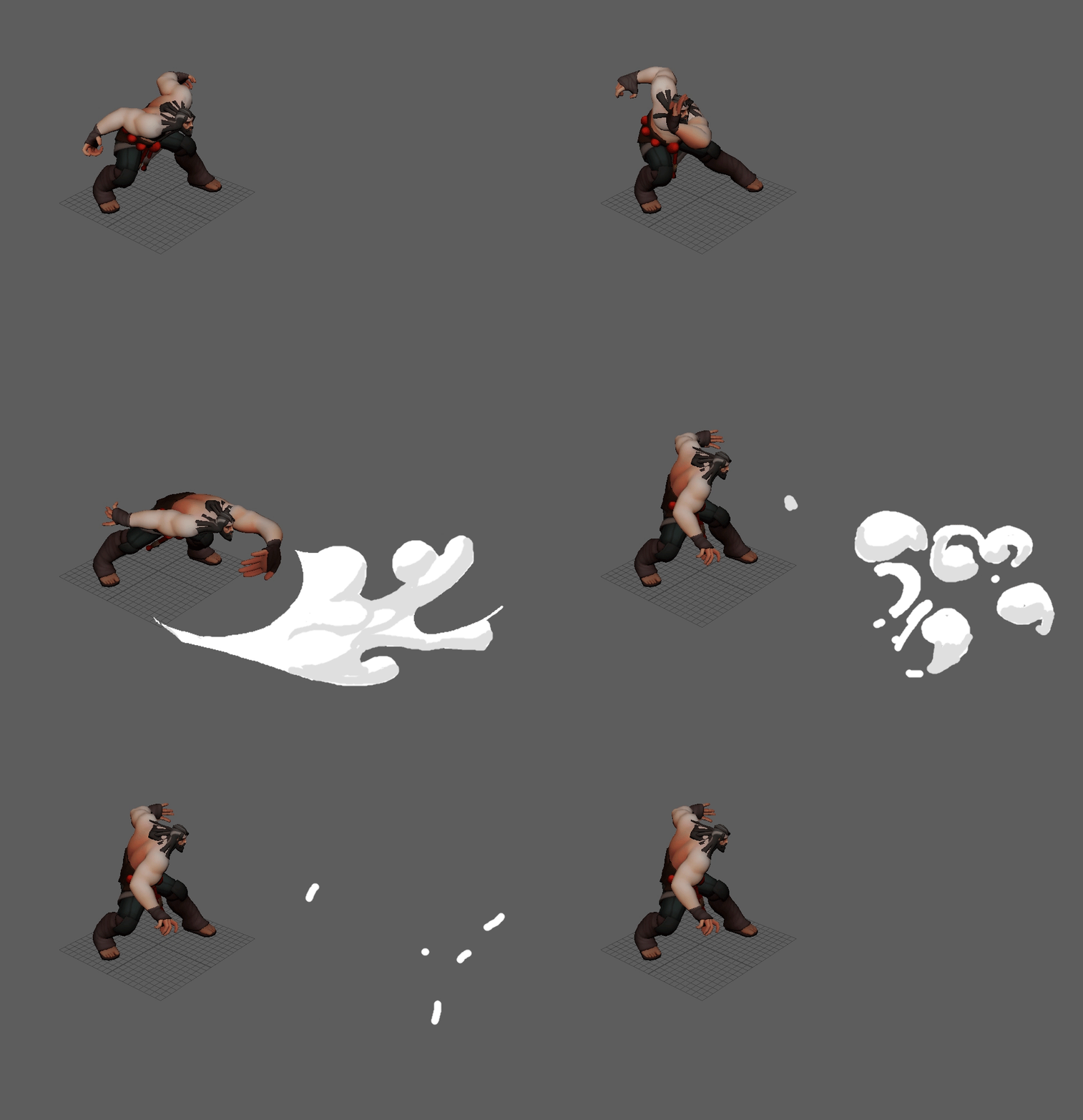
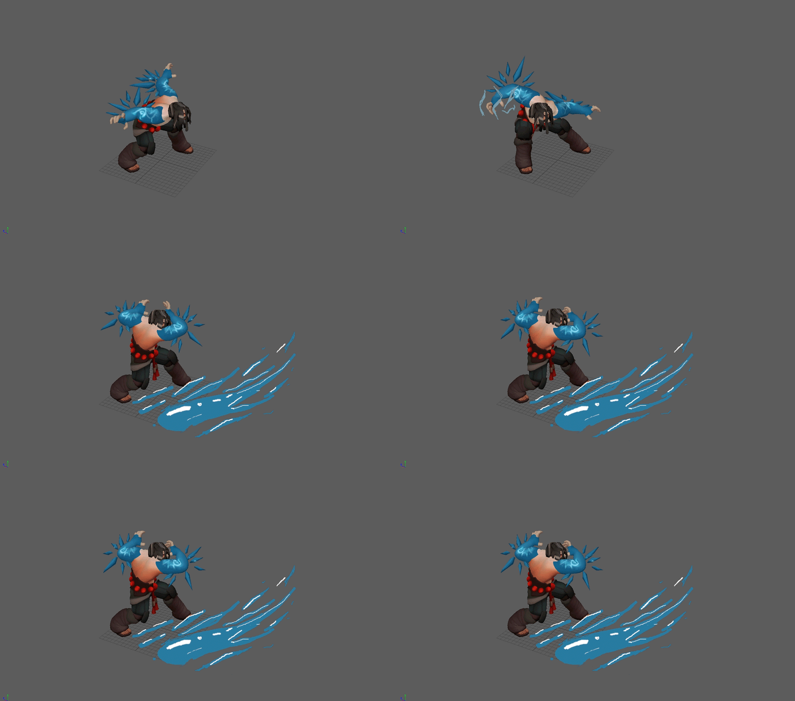
Gameplay clarity is really important in League, and I knew Udyr would be challenging because I needed to look at each of his four stances as separate from each other, but still connected—because they needed to feel like Udyr in order to be clear in game. But I also wanted to animate his stances as if they’re four different champions with entirely different characteristics. That way it won’t be confusing to figure out which stance he’s in.
Udyr holds a deep reverence for wild animals, and I wanted that connection to be clear in his animations. Phoenix stance was the most challenging to animate and it took many iterations before I found the right direction.
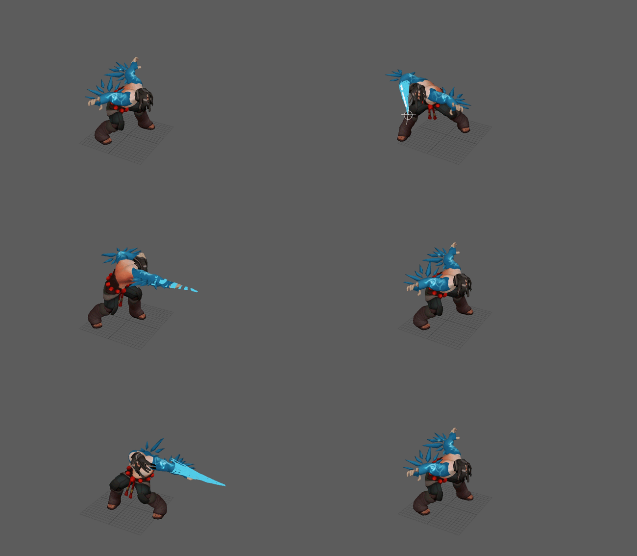
We wanted his pose to look bird-like, magical, and related to ice, which is... a lot. I also wanted to preserve his wildness, so after much thought, I came up with the wind attack idea.
The idea was to mimic a bird’s wing, with Udyr creating wind with the swipe of his arm. I liked the direction a lot, but there were a few problems: The size of the air made the attack look like it hit multiple enemies instead of just one, and the team wanted this stance to be related to ice more than wind. That meant I needed to go back to the drawing board.
My next idea was to animate Udyr creating ice instead of wind, so that it looked like he was using his magic to attack with the ice. We all liked this direction more than the first iteration with wind, but we were afraid that he looked too magical and lost his wildness aspect that’s key to who he is. That meant I needed to find a good balance between his magical power and inherent wildness.
Next I leaned more into a physical version of ice. And while I really liked this direction, it felt like it lost the connection with birds.
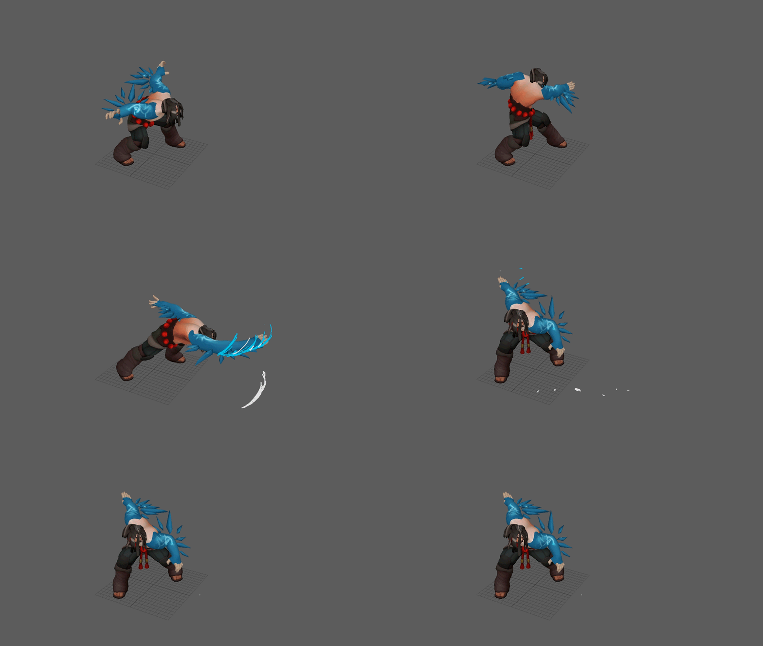
So I changed the stabbing lunge to a swipe to bring in bird-like inspiration from the first idea, but kept the iced wings as a nod to a certain winged Freljordian demigod. The final idea ended up being a blend of everything I did leading up to this point, in true game development fashion. And we’re all really excited with where we ended up.
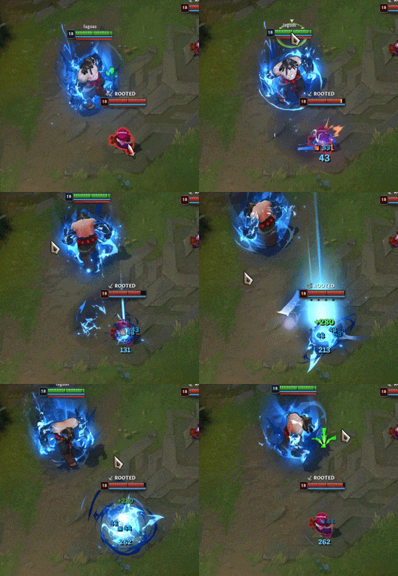
Udyr has many types of basic attacks, which meant I had to animate it for each stance. My approach to each is pretty much the same: I consider his personality first, and then need to think about the spell's function, all while making sure they feel unique to each stance. Here are some of the others using the same process:
Awakening the Beasts of the Freljord
Luis “Riot Bloois” Aguas, Visual Effects Artist:
Oh deer, it's Udyr. It's also VFX time!
Udyr's VGU gave me a good opportunity to push boundaries in League's VFX style. The first inception of that came from the question, "Can I make Udyr look like he’s in a fighting game and in League?"
Fighting games have always been a genre where you can express individual mastery over a character and its matchups. When I looked at Udyr's new gameplay, I immediately thought of that individual character skill expression you’d find in a fighting game. His stances have different use cases—Bear Stance is great against certain champions in a 1v1 duel, Phoenix Stance is great in an AoE situation, and so on.
I picture an Udyr player knowing when it’s the right time to use the optimal stance, and that being the thing that differentiates between a good Udyr player and a great Udyr player. He’s an incredibly versatile and flexible champion—exactly the type of character I’d want in a fighting game.
But fighting games and League are two different games with two different types of VFX. Where’s the happy medium?
Before we get into examples, let me explain Udyr’s passive, which is what I’ll be talking about: If Udyr is already in a stance and it is on cooldown, he can Awaken it. Each stance has an empowered form or function when it’s Awakened.
With this in mind, his passive should visually make you feel powerful when you Awaken each stance. Going back to my original goal of trying to combine League and a fighting game, I decided to go for heavily stylized, sharp, hard-edged shapes to hit that “powerful feeling.”
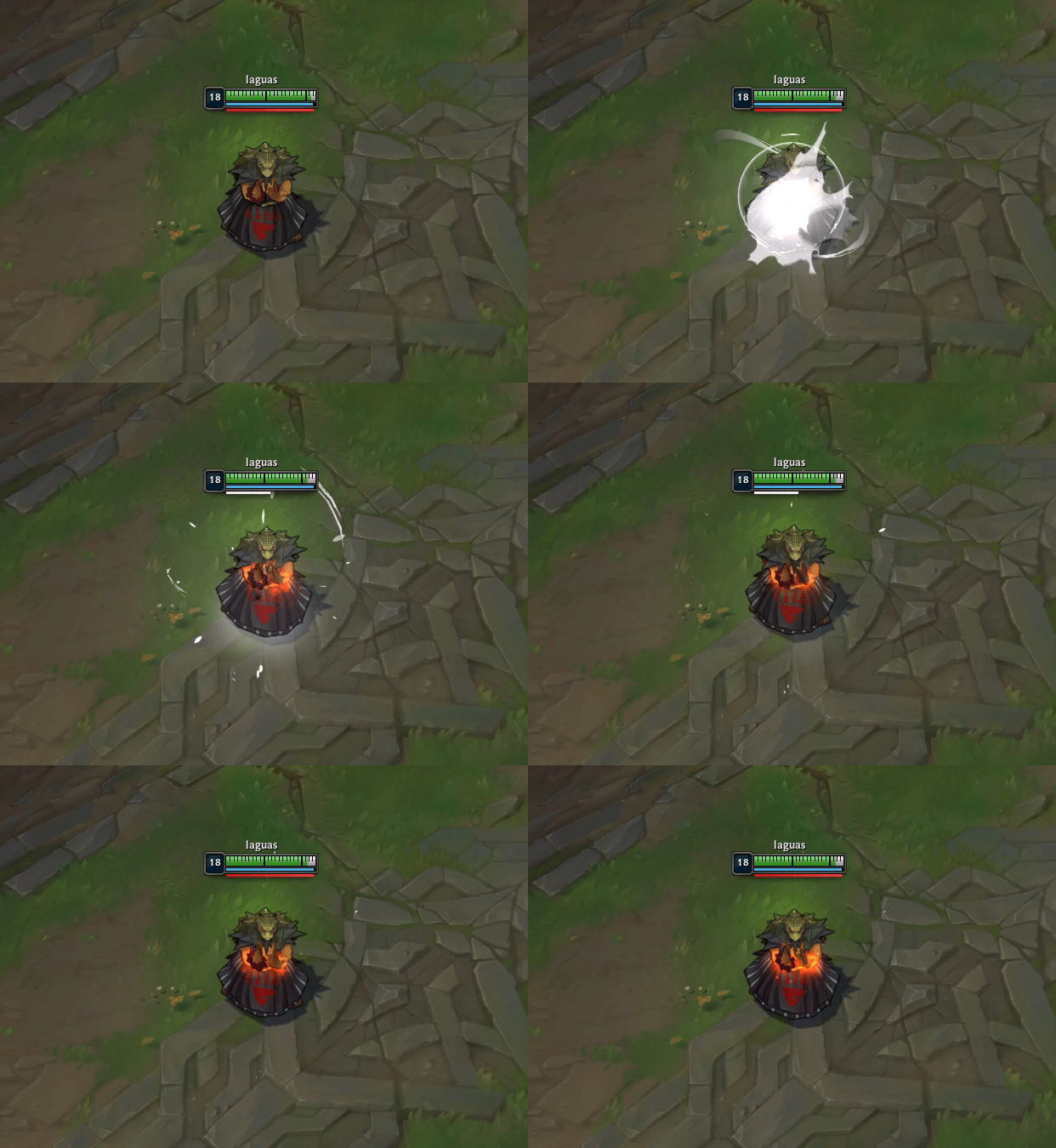
After looking at the first iteration I decided that, while cool, the direction didn’t quite fit League’s VFX style. So... now what?
I looked for answers in Udyr’s spiritual energy. What does this power look like after he channels it? How does it feel connected to the spirits he holds dear?
I replaced the hard shapes with softer ones to match League’s VFX style and introduced color to deepen the overall fantasy. But I couldn’t stop thinking about that initial fighting game design, so I had a thought... What if we add everything together and make color the differentiator between his stances?
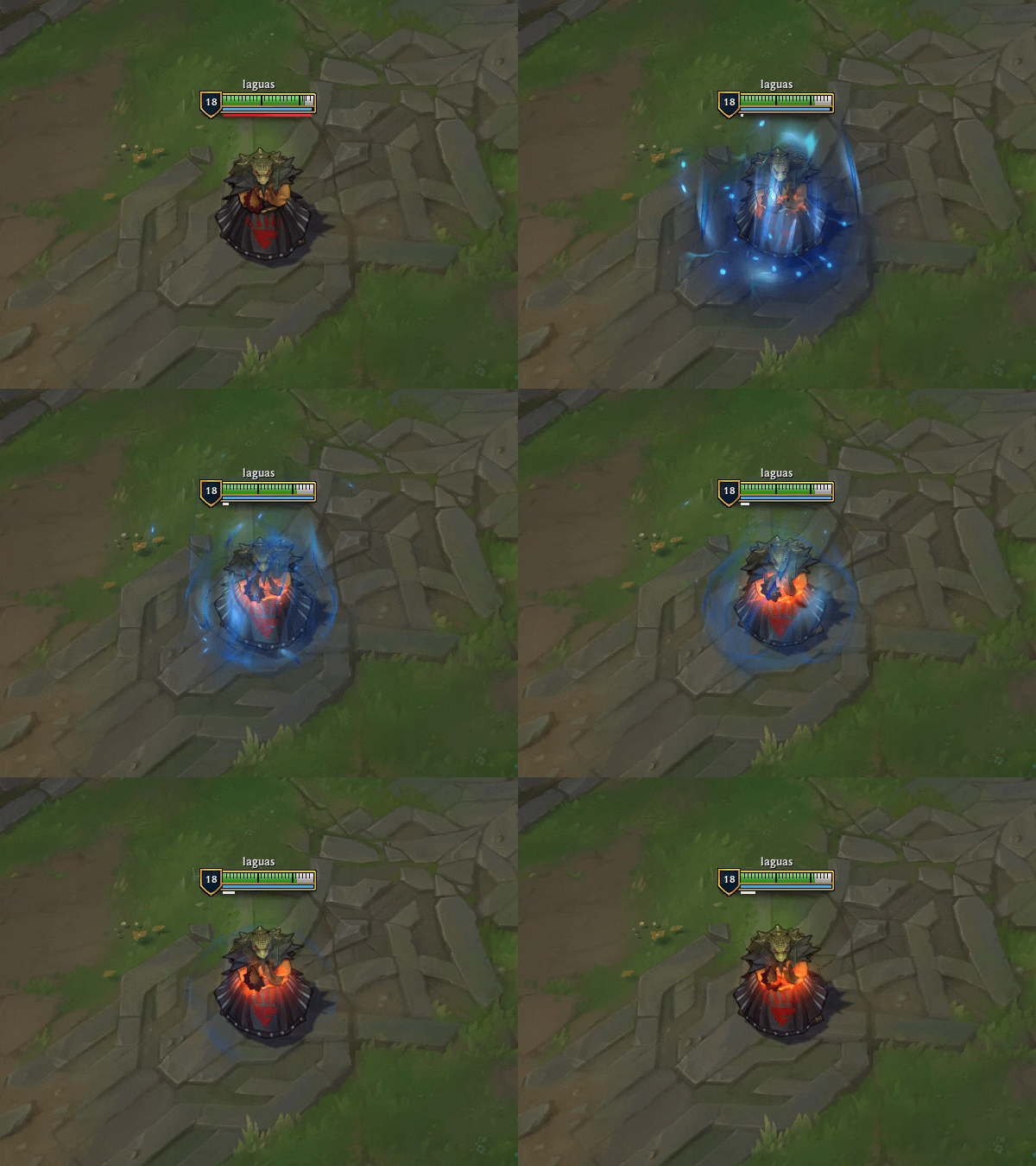
Exploration of the new combined visual effects
Because there are 4 stances, I needed to create a color palette for each one. These visuals are all using the same exact VFX, with the only exception being their color!
Bear Stance on the left and Ram Stance on the right
This design felt really cool, but nothing actually communicated that Udyr entered a more powerful form. So I decided to tone down the visuals I had and focus on a way to make it clear he was in an enhanced state.
Up until this point I was creating VFX on Udyr’s old model. But around this time OOYOO completed an updated proxy model to give us a better idea of how he’d look in game. This meant that I could start creating VFX based on Udyr’s updated kit and model, instead of just “blue skies”ing ideas on his old one.
Before I got started working with Udyr’s new model, I needed to prioritize which elements of his gameplay are most important to communicate. For example, when you press Q, three things happen:
- Udyr enters Bear Stance
- Udyr gains bonus attack speed for the next two auto attacks
- Udyr gains bonus attack speed for a certain duration
Since the bonus attack speed lasts longer than the Awaken passive, that gets a higher visual priority. But even higher than that is making it clear which stance is Udyr in.
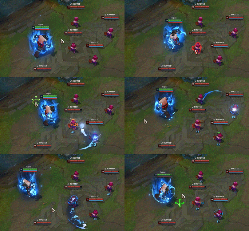
In League, we typically communicate an auto attack enhancement by applying VFX to a champion’s hands. In Udyr’s case, I added lightning VFX to his Bear Stance’s bear claws to indicate that Udyr’s auto attacks are doing something extra. There were three visuals I needed to create, with each one unique but still feeling connected to the others: The idle VFX with bear claws active, the stance activation with the active Awaken buff, and his passive’s Awaken VFX cast and buffs.
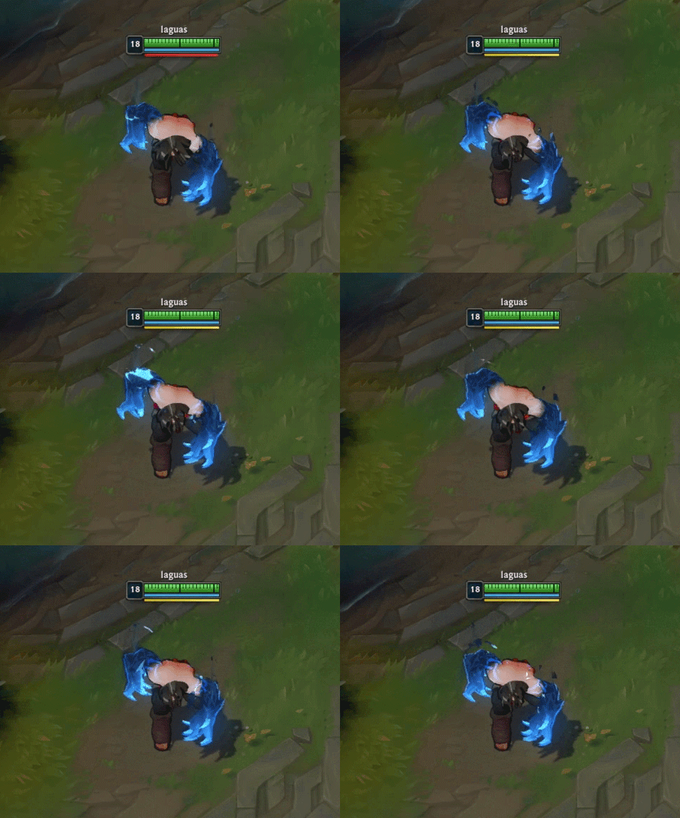
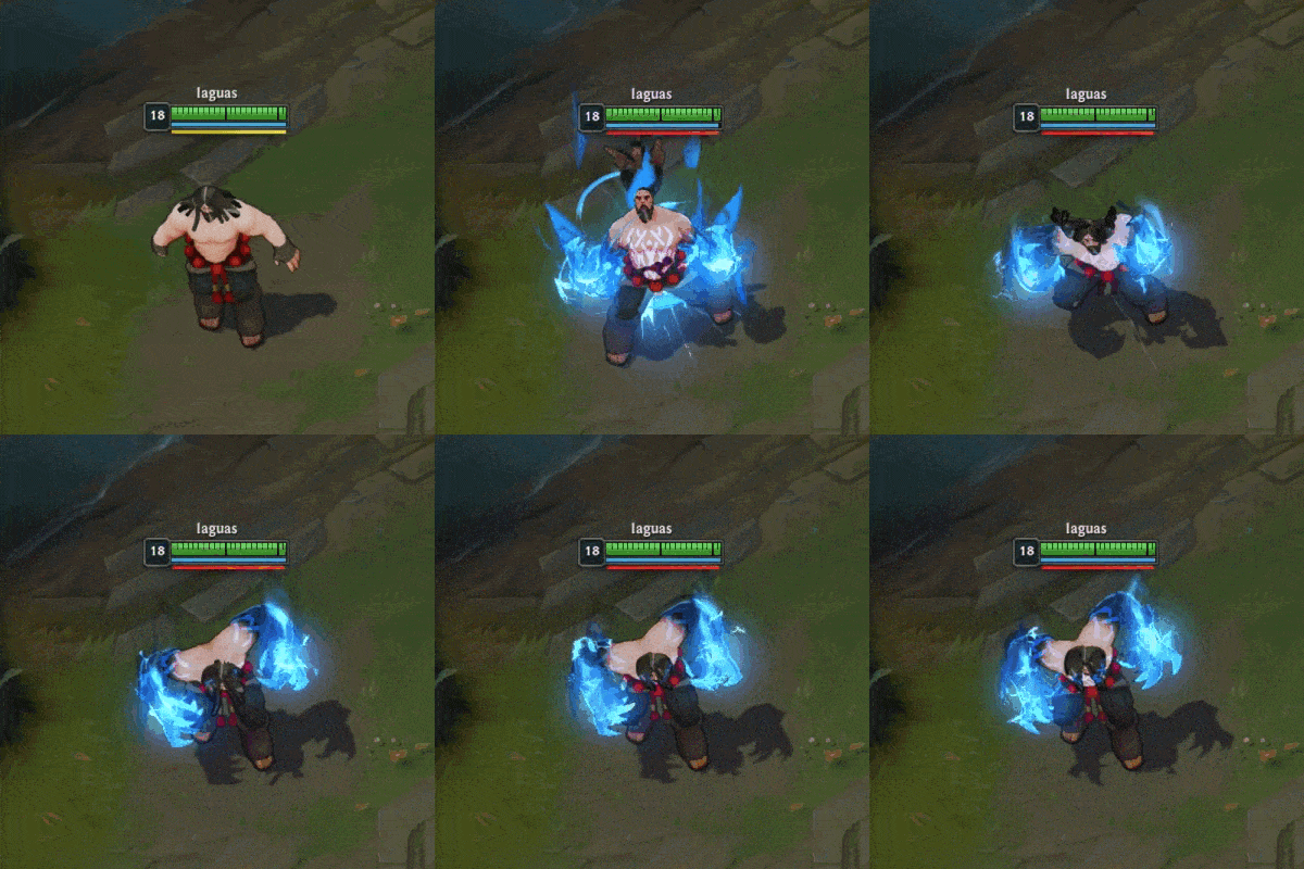
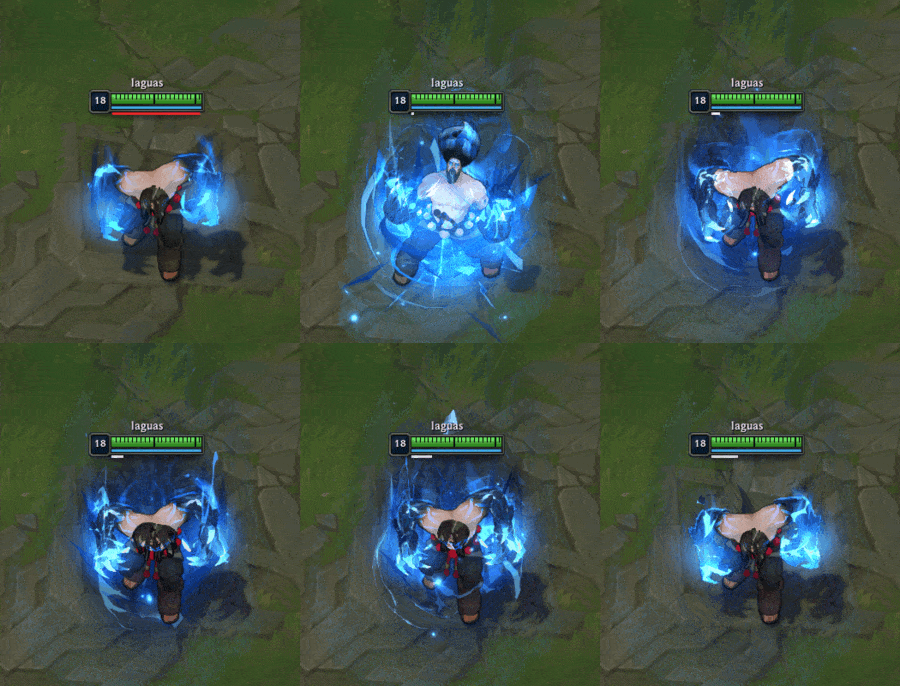
You might notice some of the visual language from my early “fighting game” exploration and that’s because... it’s there! I was able to combine sharp shapes with thematic lightning hooks and soft blending to ground it within League’s VFX style while still giving it something uniquely Udyr.
Then I needed to move on to the effects when you interact with enemies. When Udyr’s Bear stance is Awakened, your next two auto attacks will arc chain lightning to your primary target and then spread nearby enemies. (Sound familiar?)
Furthermore, when this arc of lightning hits a single target and doesn’t bounce to others, it’ll do increased damage. Kind of like a big lightning bear when he’s mauling your face.
And that wraps up what I’ve got to share for Udyr’s VFX! As a reminder, everything I’ve shared is a work in progress, and the final product may still end up a bit different than the direction we currently have. I hope you like what you’ve seen here, and I can’t wait to see what you think when you get your claws on him. Thanks everyone~!
Channeling the Dragon Spirit
Justin “RiotEarp” Albers, Concept Artist:
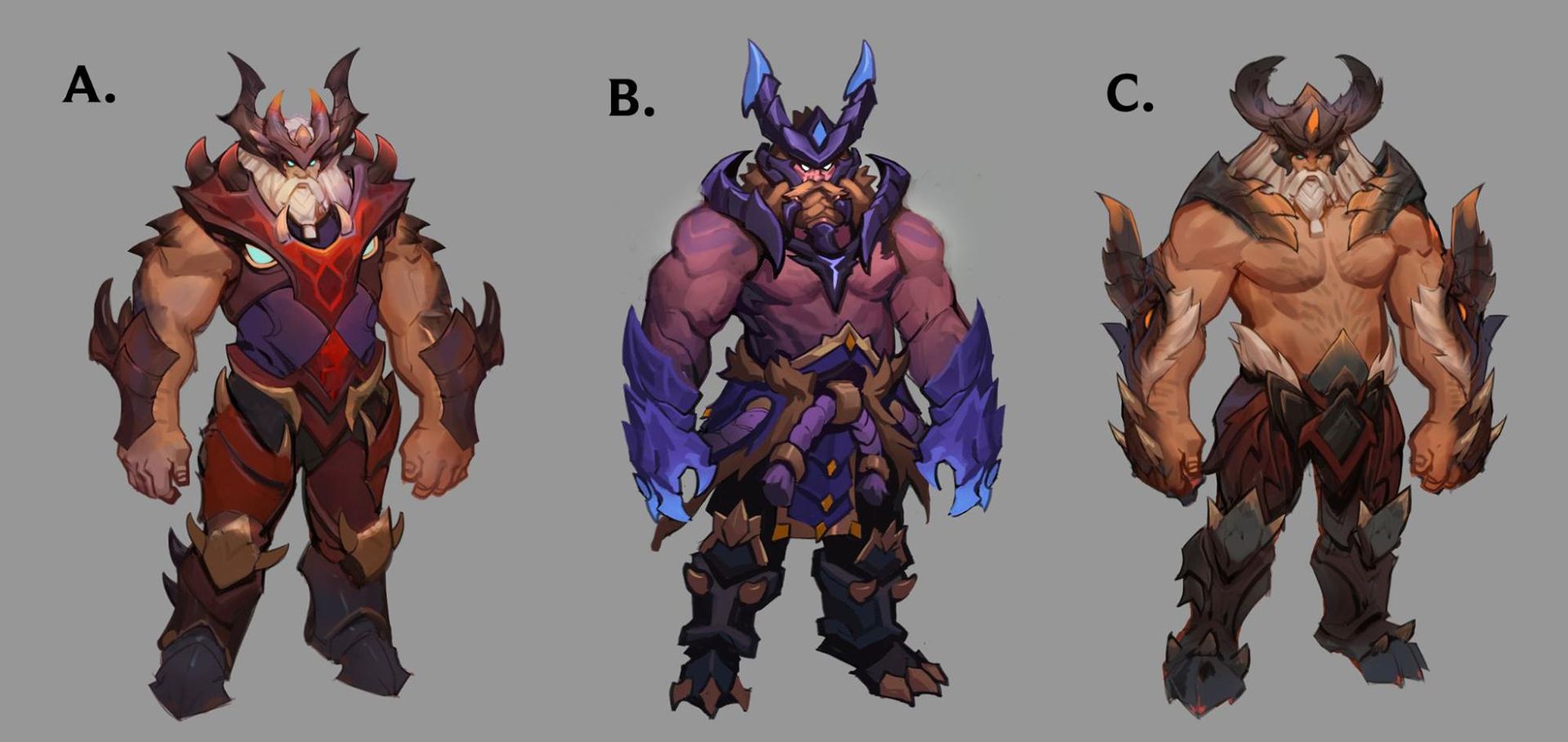
Udyr has just a few very classic, very well-known skins in his catalog (Spirit Guard, anyone?), and as we were figuring out his base, we were keeping ideas for his skins in the back of our dev brains. We decided to start with his most recent, Dragon Oracle.
It’s a great looking skin with an excellent thematic, so there’s a lot to keep with some things that need to be adjusted to match his new character. Also, the dragon thematics and colors will easily translate to what the new-dyr is here to represent.
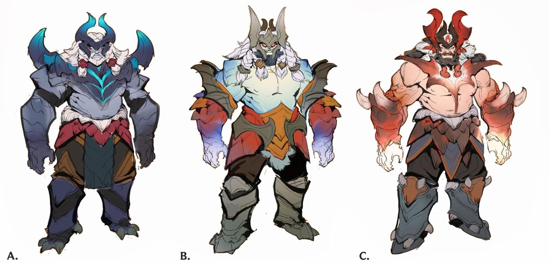
We wanted to do our due diligence by going wide with the explorations—we have a pretty solid understanding of this dragon world now thanks to the extensive amount of skins—so we focused on a few different areas. We decided early on that he should remain on the mystical dragon side of things, and not among the draconic division of dragonslayers—he still channels the dragon spirits for just a hint of their power. But that left us asking, how dragon-y should he look? How physically affected is he by the animal spirits he channels? (That will forever be a question on Udyr!)
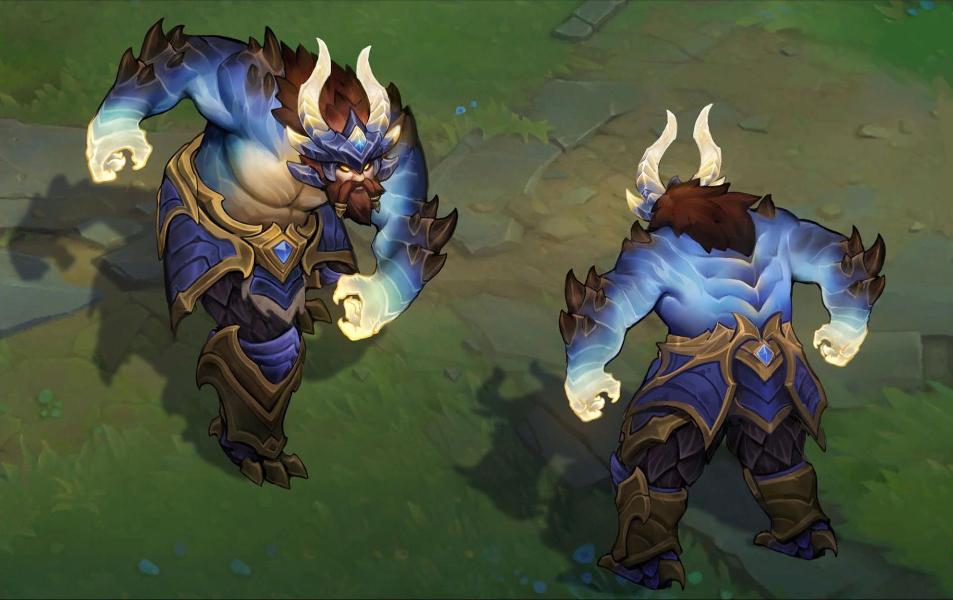
We decided to keep Udy more human than dragon to show that he’s in control of the draconic power he’s summoning. Some dragon elements will be cool for this skin, some scales, and definitely horns! But overall we want to keep his arms and shoulders free to show off his stances and animations.
Next we’re honing some of the more minor details for his base before doing the in-game version and concepting the dragon form stances!
And here’s where we’re heading with this skin: getting into the in-game view and his ortho for modeling.
There’s lots more to come on Udyr skins, so keep an eye out for these in a later update!
What Comes Next?
As you can see we’ve made a lot of progress and we think his base is coming along nicely. I think it’s worth sharing that Udyr does have quite a few skins, and the nature of his form swapping makes each one take longer than the average champion would—not to mention he also has an Ultimate skin.
Given all that, we still have a ways to go before we can finally get the new Udyr into your hands. We want to make sure we get him and his skins right before he releases into the wild, and we’ll be sure to keep you updated in future champion roadmaps once we have a clearer picture.
